Category Archives: painting

Art journal double page collage, quote 'Focus on what could go right'.

Still stuck in a craft rut.

I am finding it difficult to get motivated to anything right now.  The weather is just cold, wet and miserable and the craft room is too cold to work in.  I am in a bit of a rut so I went through some old art journals and sketchbooks that I have for inspiration.  The next few pics are from an old small 9cm x 14cm hard cover sketchbook (maybe a Talens Art Creation book).  They are quite good little books but as I open them out to do double pages the spine takes a bit of a bashing.  I used quotes that I liked and tried out multi media and methods.  So I am feeling inspired to do more of the same.

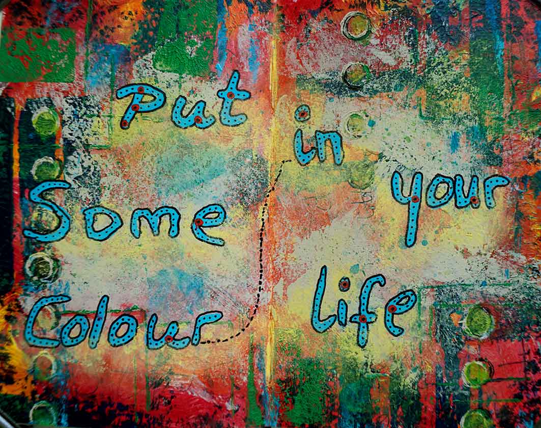
There is a youtube channel called ‘Put some colour in your life’ so using mainly acrylics and pastels  and some posca pens I made this colourful double page spread.

colourful art journal double page spread quoting put some colour in your life
Colour in your life.

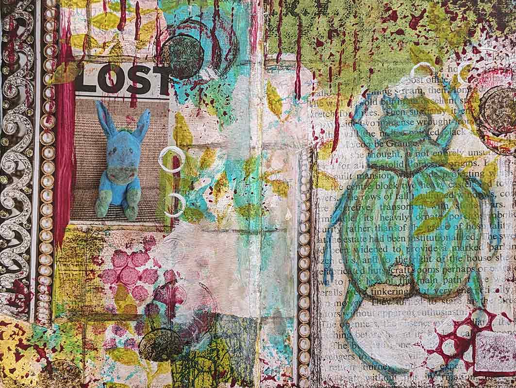
For this one I collaged some clips from magazines and an old page from a book.  I highlighted the words ‘craft’ and ‘tinkering’ in the book page as when I am feeling a bit lost I like to just tinker and play in the craft room rather than go full steam into a project.

art journal page using multi media, old book pages and magazine clips for collage.
Lost.

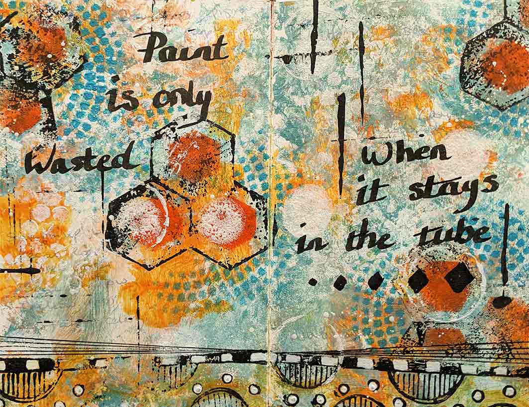
One of my bug-bears of painting is that it uses up a lot of paint and supplies which is expensive and I used to worry that I was wasting not only time but all of my art media things didn’t turn out well.  This quote helped me change my attitude to that way of thinking. Paint is only wasted when it stays in the tube – so true.

art journal double page spread. Quote:'Paint is only wasted when it stays in the tube'
Wasted paint.

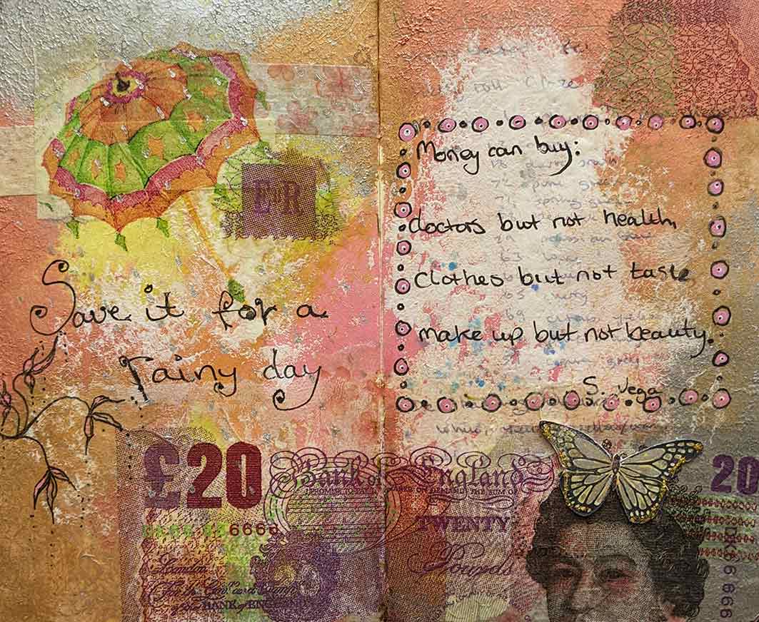
I think the next quote was by Suzanne Vega.  ‘Money can buy: doctors but not health, clothes but not taste, make-up but not beauty. ‘  More collage work using collage papers and a napkin £20 note.

art journal double page quote about money, collage.
Money can’t buy:

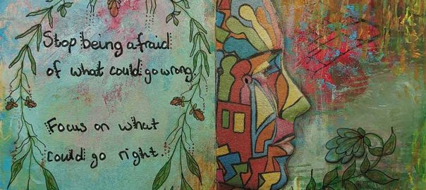
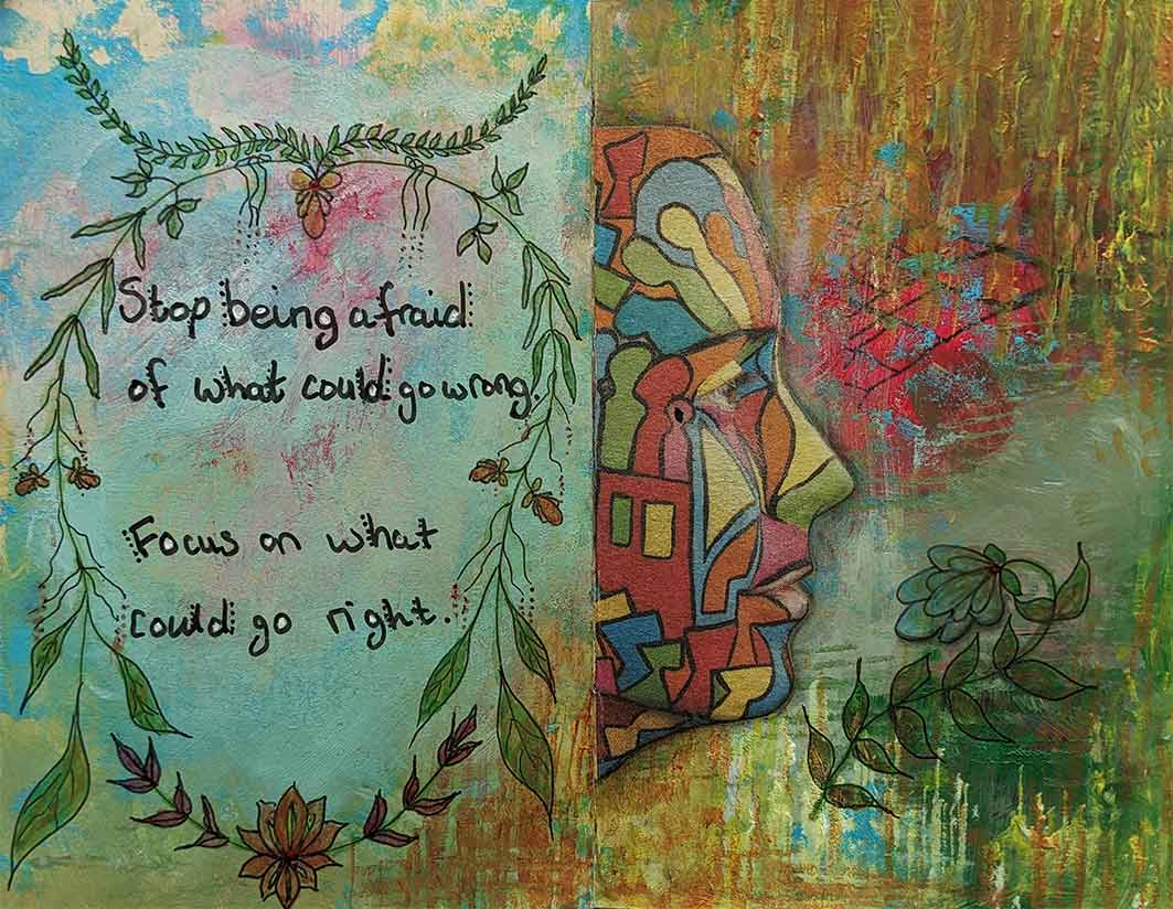
Always worrying about things not turning out right will stop you doing anything, so you have to focus on what can go right and not what could go wrong.

Art journal double page collage, quote 'Focus on what could go right'.
Focus on right.

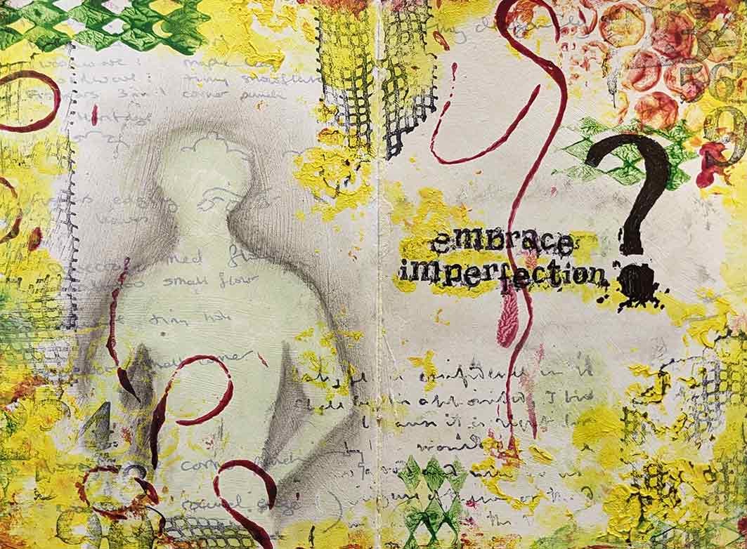
Don’t strive to be perfect but just making progress is good enough.  Embrace imperfection uses acylics and stamps.  I used to use this little book to list all the media (stuff) that I had so that I wouldn’t buy doubles but that never worked so I painted over the pages to use it as an art journal instead.  Here I have left some of the writing showing through the paint.  It is a nice wee reminder  that it isn’t about what you have, but how you use it that counts.  Wabi sabi comes to mind as the Japanese find beauty in imperfections.

art journal double page with acrylics and stamps 'Embrace imperfection'.
Embrace imperfection.

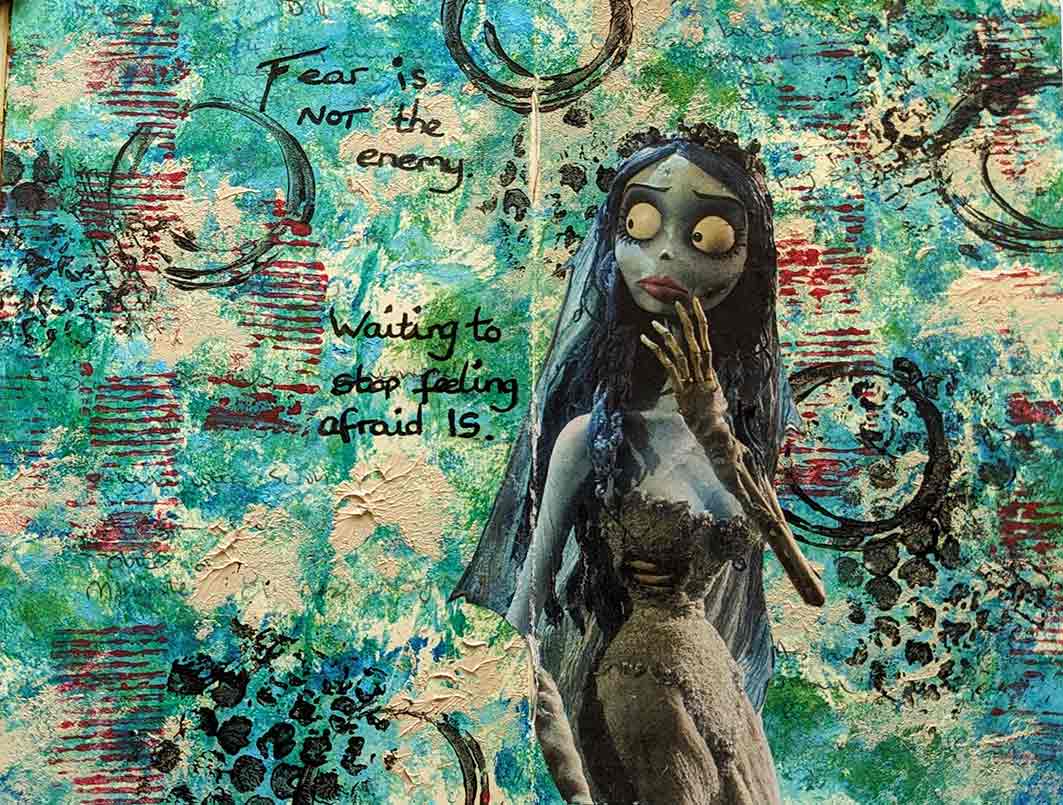
Fear of the blank page (or anything else in life).  this quote sums it up nicely.  ‘Fear is not the enemy.  Waiting to stop felling afraid is’.  I don’t know where some of these quote come from, maybe a podcast I was listening to or a TED talk?  Mainly acrylics in this one and a bit of collage and stamping using found objects.

Art journal double page, 'Fear is not the enemy. Waiting to stop feeling afraid is.'
Fear.

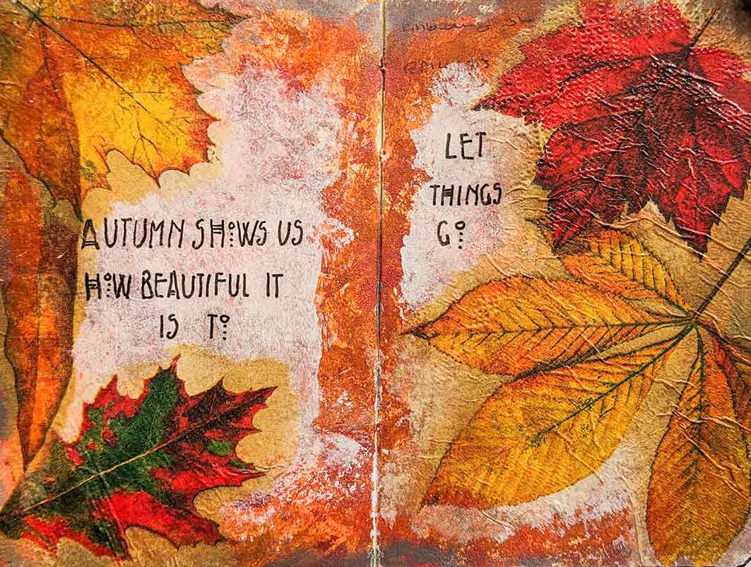
Using napkins with bright autumn leaves on and gel medium, I added this quote;  ‘Autumn shows us how beautiful it is to let things go.’  Oh if only we could just let things go.

Double art journal page with bright autumn leaves falling, with quote 'Autumn shows us how beautiful it is to let things go'.
Let things go.

So I still have plenty pages to fill up yet just need some more quotes.


Kingfisher mixed media painting.

Ali Hargreaves gave another fab demo  on Artist Demo Days on facebook, this time  a watercolour  (or mixed media) of a rather bedraggled kingfisher.  I had a go and made a small painting and it was fun to do.  I still haven’t found a way of getting the turquoise colour to be true on the photo.  I used some shimmering blue acrylic ink and some pearl Pearlex for some of the white flashes on a few feathers.  In other  places I have used white acrylic ink and pulled the ink out to makes the ruffled feathers.  You can also find her demo here.

mixed media kingfisher

Hellebores watercolour painting

I had a go at Ali Board’s watercolour of some lovely hellebores from her book (A beginner’s guide to Watercolour with Mixed media) .  I have many of these in my garden but they aren’t looking there best right now and, although I do have a few of my own photographs of my hellebores, they don’t look as nice as the ones in her book.

I quite like how it turned out but  I still need to get looser with the paint.  And the phone camera never picks up the subtle shading so it looks a bit bloby and patchy.

hellebores watercolour painting

Tompot Blenny Fish using coloured pencils.

I was reading a science magazine one day and found a fabulous photograph of a Tompot Blenny fish which looked so colourful and full of character that I wanted to have a go at painting it.  With kind permission of Alexander Mustard (the photographer) I had a go.  I did a rather scruffy, coloured pencil painting/sketch in my sketchbook.   I did not do the photograph justice, so one day I will do a better painting but perhaps with water colour, acrylics or mixed media. It needs some really bright colours.   As usual, some of the blended colours did not show up on the photograph below, especially the turquoise in the background.  It was fun to do but I am not happy with the result, it is too scratchy looking and not bright enough.  Must do better.


Abstract self portrait.

Over on Artist Demo Days on facebook, Ali Hargreaves did a few demos on cubism (it is also on you tube here .   Now, although I don’t like cubism, I thought I would give the self portrait a go as Ali’s finished painting was really good. Cubism uses geometric shapes and lots of straight lines and for someone like me, who likes soft and fluffy, this was difficult.  My hair had grown a lot during the last lockdown and was quite wavy so I used crescent shapes to depict the waves and so that meant it didn’t look too harsh and jaggy.  I used  my Bockingford NOT block 300g as I was going to be using watercolour but I should possibly have used a smoother paper to get smoother outlines.  I ended up using a mixture of watercolour, Marvy le Plume pens, Copic pens, Stabilo pens,  Posca  pens, inktense pencils, gold and silver Pilot pens.  In a few places I added a little sparkle using a gel glitter pen and the outline is in black Faber Castell Pitt pen.  The pale colours in some Copic pens don’t show up well in the photograph, and the dark English red Marvy le Plume looks almost black in places..

You start by jotting down a few things you like and try to incorporate them into your painting.  You don’t have to use them all.

list of happy things


You begin with a soft pencil sketch then go over the outline with a permanent pen.

abstract self portrait outline


One you have your outline, it is just a matter of colouring in and adding some patterns – great fun.

abstract self portrait

My abstract self portrait is almost zentangle and not really cubism in my opinion.  At the end I added a bit of sparkle and a few gold and silver highlights but they don’t show up on the photo.  The whole process was a lot of fun.

My husband really likes this painting and wants it framed and hung on our wall.  Even though I really like it, I can see all the wee mistakes that I made.  Also I have painted right up to the edges and a mount will cover the detail at the edges.  So my dilemma is: do I start it again using smoother paper and leave a border for a mount, or,  just go ahead and get it framed?  I am quite a lazy artist and don’t like the thought of doing it all again, but I don’t really want to hang something with mistakes in it.  Anyhooo, there is no rush to make the decision as we are in another lockdown, and as we are shielding we aren’t going anywhere.

White cat painting.

white cat paintingGhost

Sharon Hurst did a demo of this painting of  white cat  (Ghost) over on Artist Demo Days on facebook.  Using salt on the watercolour background is very effective.  The turquoise colour doesn’t show up well though on this photograph.  It was fun to do although I may have made Ghost a bit jowly.

Physalis and poppy heads mixed media painting.

Practising with some texture in this painting using sand mixed into acrylic paint.  This was painted using the techniques from  Alison Board’s first book ‘A beginners guide to watercolour with mixed media’.  I love this book as it it gives you lots of ideas and easy to understand instructions and I like Alison’s lively, loose painting style.  I used dried fern, fennel,  and acer leaves dropped into the wet background and left to dry.  There is also some lifting out, using a leafy stencil and a magic sponge eraser, and some messy splattering and dripping.  The camera hasn’t quite picked up on some of the subtle shading so it looks much better in real life.

Owl mixed media painting

I am a big fab of Alison Board, so whenever I get the chance I watch her demos on Artist Demo Days on facebook, or on her own web page, then sometimes I have a  go myself.  However this one is from one of her workshops on the SAA site.  I used watercolour, gouache, brusho,  conte crayons and a fine liner pen.  Alison used a photo of Boo, a little owl, which has such a lovely face, and I love the splashy loose techniques she uses.