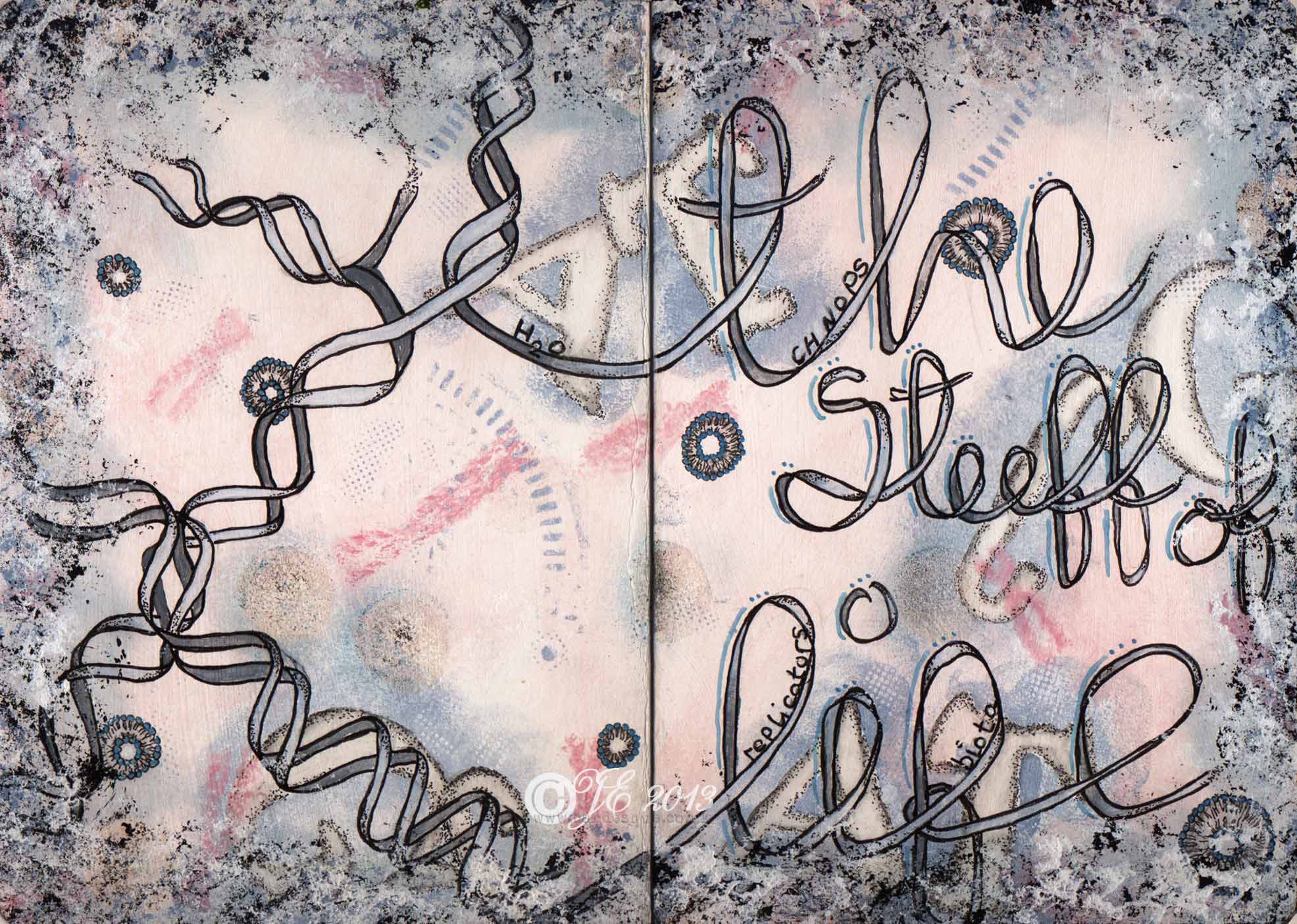
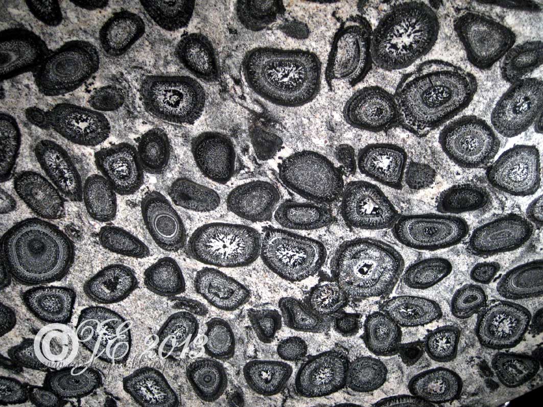
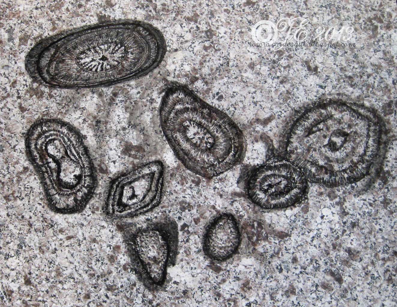
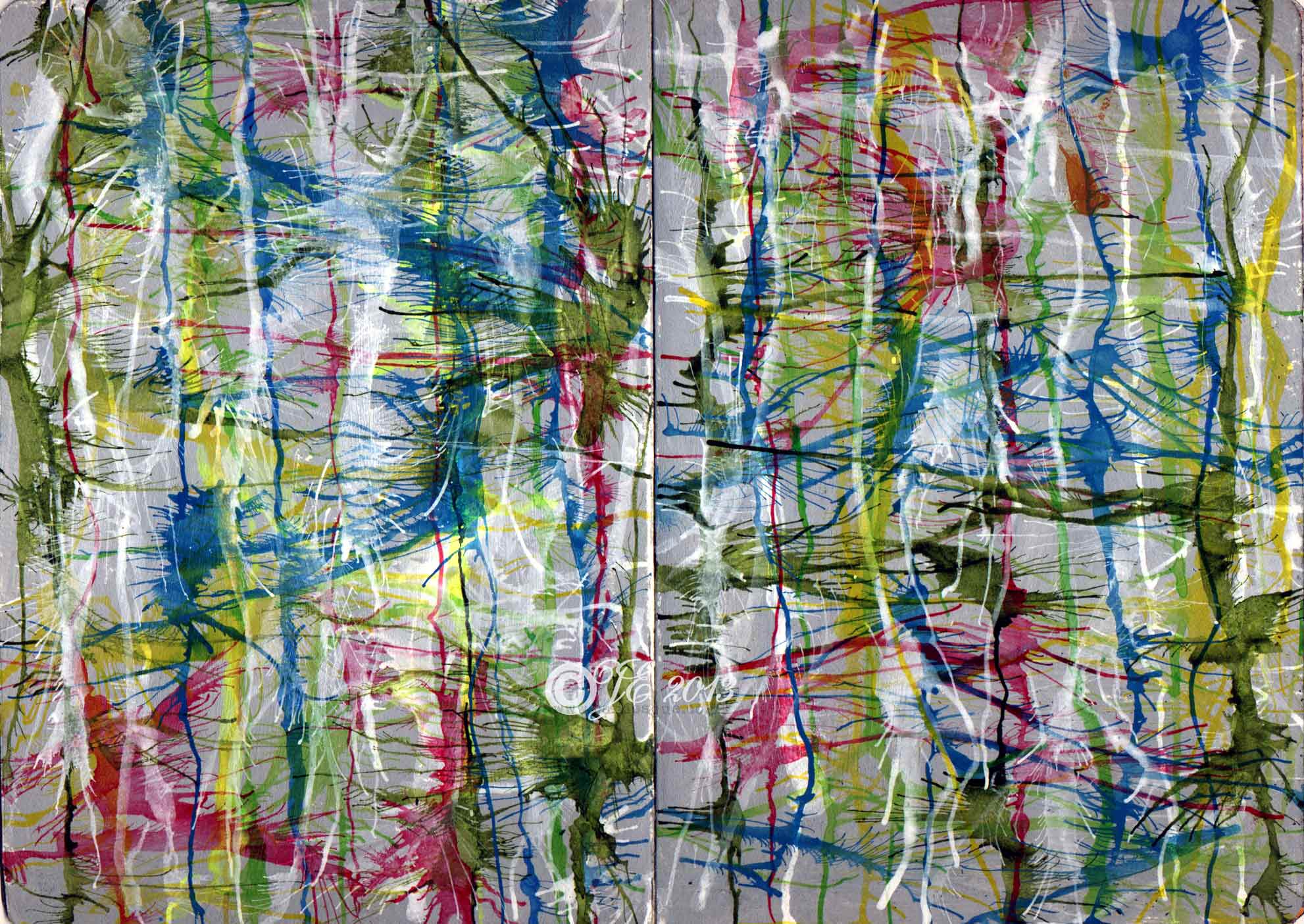
Category Archives: art

Sketchbook Project 2014 Organised Chaos (page 4) Chaos

Chaos

Inspired by the book CHAOS making a new science by James Gleick; another good read.  The Butterfly effect (sensitive dependence on initial conditions).  Tiny changes can have large consequences following a chain of events. (this is only a small portion of what the book is about – he explores randomness, patterns, science and maths and other theories).  Again this double page has watercolour pencils, inktense pencils, black Pitt pen and some butterfly stamps.

Sketchbook Project 2014 Organised Chaos (page 1) Daisy world


Inside front page

P1daisyworldSml

The first pages of my little book.  I used the verse from The Big Bang Theory (by the Barenaked ladies) to get the book started then  the first page depicts Daisy world from the Gaia theory of James Lovelock.  He describes a kind of planetary feedback mechanism to maintain Earth’s homeostasis.  In one very simple model he talks about black daisies and white daisies bringing this about and this is what I imagined as I read it.  I used acrylic paints, black pen, Prisma pencils with sansador and some sequin waste as a stencil.


Sketchbook Project 2014 Organised Chaos (cover)

coverSml

I finally finished my Sketchbook project for 2014 and it is now in Brooklyn and will go on the Northeast tour in 2014.  I like the idea that my little book will be going on tour and not just sitting in my bookcase at home.

The theme I picked was ‘Greetings from…’ so mine is Greetings from this extraordinary place called Earth and is named Organised Chaos.  What makes out Earth unique?  Is it just chaotic randomness or is it all structured and within the laws of nature?  Why do you find similar patterns emerging on different surfaces.  I don’t give any answers I merely depict what was going on in my head while I daydreamed about the questions.  I took out the rather thin paper that was in the journal and used bamboo paper instead as I like to use all kinds of media.  I also changed the cover from the plain brown card one to a grunge board one which I then painted with gesso and acrylic paint.  I sprayed the cover with a light coat of sealant but it reacted a little with the ink on the label so I hope it still scans ok.

Natural surfaces sketch

granodiorite2Sml

Finally on the last day of the sketchbook challenge for March I have had time to do a sketch.  The theme for March was Natural surfaces – I absolutely love the patterns you see all around in nature and I have quite a few photos of surface that I have yet to do something with.  A while back I took a couple of photos while we were visiting the Natural museum of Scotland above is orbicular granodiorite.  You can capture quite a lot of detail even with my small camera and I can see I will have fun doing a few things with these images when I have time.

 sketchGranodioriteSml
sketchGranodioriteColSml

I did a small sketch using shades of grey Pitt pens on some patterned paper which already looked like a stone background.  This was then manipulated in photoshop (inverted and coloured) to add colour.  I was just mucking about so I don’t know if I would ever be able to replicate it.

Tarte tatin sketch

tarteTatinSketchBWsml

To encourage me to try sketching a bit more for practice I have joined the sketchbook challenge and this months challenge theme is ‘Sweet: sugar and spice and all things nice’.  I didn’t know what to sketch so I flicked through some cook books and found a photograph of a delicious looking caramelised apple flan (or tarte tatin) so I thought I would have a go.  I scanned my sketch with a sheet of acetate over it in black and white mode so it is not picking up the subtle colour of the pencil.  I am looking forward to doing a few more of these challenges.

Old cottage watercolour on news print

oldCottageWatercolourNewsSm

This was a fun exercise I did last November.  You tear a piece of newspaper and glue it to your board or in my case watercolour pad.  Then do your watercolour (or any other medium) to paint or draw your image.  You can choose how much newsprint to show through.   I found the whole process quite fun as I didn’t feel that it mattered if I made mistakes.  I was using water colour and I just slapped the paint on a went with it quite carelessly.  It didn’t matter if the lines were not straight or if I couldn’t get the shade on the house right. (the inspiration is from an image found on the web while doing a search for ‘thatched cottage’ or ‘English cottage’ or something like that but I have forgotten where.)