Monthly Archives: June 2010

RSS challenge 23

I am slightly too late to add my submission to the Ready Steady Stamp challenge but I thought I would blog it anyway.

I coloured the acetate with alcohol inks the adhered the rectangles using Glossy accents.
homeHeartSml

Inks: Memento tuxedo black, Versamagic Sea breeze chalk ink, Stayzon Cactus green
Card: white, black, turquoise and purple card
Stamps: Rubbadubbadoo Style of Clarice Cliff, Tim Holtz Chronicles foam letters
Other: acetate, alcohol inks aqua, purple twilight, salmon and citrus. book plate and brads, heart gem, lime stickles, copic pens, glossy accents, rock candy

Bridge card

bridgeSml

You may recognise the image from a previous post (9th June) – well I rescued the image by cropping it from the card, edging with black ink then layering it with the pale blue and black card. This has helped give more balance to the card. The corners were cut using a circle punch and I added some black pearl embellishments to the corners. To give the stream some sparkle I added Rock candy stickles to it.

ukstampers tag challenge 22

clocksml

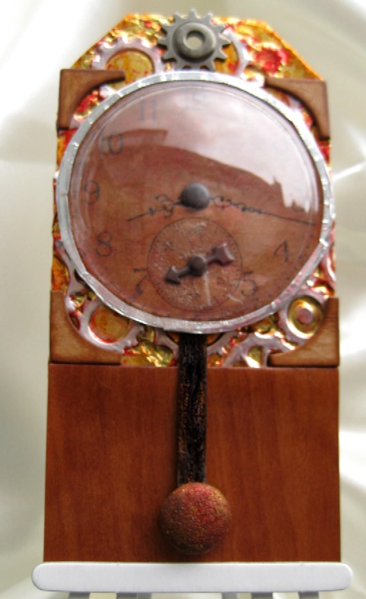
By now you will all know how bad I am at photography but I am even worse when it comes to shiny items. You can see the reflection of the house in the globe and there is also a slightly pink tinge to the silver foil (I am wearing a pink sweat shirt and this is being reflected).

The challenge this time was to include:

  • something round (clock face, plastic globe, brads)
  • something shiny (sheet of gold foil, shine on plastic globe also glossy accents)
  • and some heat embossing (stamped clock face and the large brad)

After embossing the clock face I then painted over it with the moonshadow ink and to see the lovely red mica in it I then went over it with the glossy accents. I did the smaller face first and distressed the look by heating the glaze to make it bubble up. Then I glazed the rest of the clock face.
After embossing the cogs I coloured the metal using alcohol inks then removed some the colour using blending solution on a cotton bud to highlight some of the cogs.
The large brad has been coloured with alcohol inks then embossed with the Distress embossing powder.

Inks: Brilliance Graphite black, versamark clear embossing ink
Card: white card, Bits N Pieces wood-grain paper
Stamp: Stampin up Sense of time
Other: gold metal foil, Tss Big Daddy 7 mould, brads, spinner, eyelet, cog, foil tape, clear embossing powder, Distress powder Vintage photo, card board corners, Moonshadow ink Burnt umber, glossy accents, alcohol inks

CBC June ATC swap – Shaker ATCs

shakerSml

Here are my two ATCs for the June swap over at CBC. As I am the host for this month it was my choice for the theme so I thought it would be a nice change to make shaker ATCs. The one on the left is using two little note-lets from the British Red Cross (the image is of a Voluntary Aid Detachment nurse in a garden: artist Arthur J. Lyons). The inside has lavender flowers and a few TuTu bedazzles. The flower stems are covered in flower soft.
The seaside ATC was made using Sarah Lugg Beach Comber collage paper and has a mixture of sand and a little glitter inside. I added sand all around the edges too.

ukstamper challenge week 21 tag

unicorn2sml
Well it has been a while since I last did the weekly challenge so we are now on week 21. The recipe for this week is:

  • a stamped image of an animal – I have used a unicorn
  • heat embossing – I sprinkled on some Moss and Clear sparkle and heated from below
  • something shiny – I used Glossy accents for the stream, painted on rather than straight from the bottle

I may have to take a photo from the side so you can see the twinkle and the stream but it has taken me over an hour just to get a decent photo as it is – I wish the colours would look the same as in the photo as they are in real life. The green should look more olive than it does here.

I have edited this after trying out a few photography tips and tried a few more settings on my point and shoot camera. Here is the image I came up with – can you see any difference??
unicornAsml

Inks: Stampin up Mellow moss and Always artichoke, Versafine onyx black, Memento London fog
Card: white card
Stamps: Lavinia stamps Unicorn, foliage and bridge, stampin up Autumn days and Pocket silhouettes
Other: Embossing powders Clear sparkle and Moss, Distress stickles peeled paint, glossy accents

A couple of brayered cards

bridge1sml
I have been playing with my brayer again today as I need the practice. As you can see I have used a grubby old piece of card for this one and made a few mistakes too. Maybe I really shouldn’t show you my mistakes but I hope you won’t make the same ones as I did. The tree on the right is too big and not well positioned or stamped well. Some of the foreground stamped images look squished – that is because I put too much pressure on the acrylic stamp and the ink pad was quite juicy. I thought I would give it a light spray with water to give a nice effect in the sky but only sprayed it after I had taken the masking tape off so the colour bled out. The left hand side looks too black. The flock of birds are positioned too high. Having said all of that I still quite like it even though it was a different flock of birds stamp that I had intended to use.  I will try and save it somehow.

Inks: Versafine onyx black and Imperial purple, Stampin up Pale plum and Bashful blue, Memento London fog.
Card: white silk card
Stamps: Lavinia stamps bridge , flowers and foliage, Stampin up trees, Encaustic art tree, birds stamp from an Oriental collection
Other: spritz of water, glitter pen just over the stream

sunsetsmlThis design I found on you tube by stampwithtami – I wanted to see how other people used their brayer so I had a go at this one.
When I went straight down with the yellow colour on my brayer my sun mask shape rolled down too to give a very slight moon underneath but I think I covered it well enough. The red looked a bit stripy so I turned it to landscape and rolled it from the small edge inwards rather than down from the top in portrait orientation. This looked a lot smoother.

Inks: Versafine onyx black, Stampin up More mustard, Adirondack Expresso and Red pepper
Card: White card, mustard card, red card
Stamps: Lavinia foliage and birds (found it!) , Judikins bamboo,
Other: punched hole mask

Fairy garden card

fairyGardenSml
Today I have finally had time to play with my new Lavinia stamps that I bought ages ago. I have mixed them up with other stamps which I think go really well together. Although I have added my copyright to this image I did get the original idea from some of the cards in the gallery over at Lavinia stamps. Check out her secret garden cards they are lovely. In fact they are all beautiful and my wish list just keeps getting longer.
This card will be winging it’s way to the Greek islands to Lizzie, my fabulous friend, who will be on holiday on her birthday.

Inks: Versafine archival onyx black, Stampin up Mellow moss, Certainly celery and Pale plum, Adirondack Woodlands
Card: white silk card, ivory card, black card
Stamps: Lavinia stamps, R.S. Tapestry stamps, Basic grey flourish corners
Other: pearl embellishments, Distress stickles Rock candy, Broken china and Peeled paint

Father’s day origami shirt card


shirt2Sml
Yet again the photo does not do this card justice. I made this for my dad, who is not having the best of times health wise, to go with his new Tattersall shirt. Dad had a mini stroke back in March and he is making very slow progress. Just when he starts feeling better he is struck down with something else. He has always liked these shirts as they are soft and cosy and even though it is summer time it should help keep him warm.

The background paper is just made up of lines in 3 colours (wine, green and blue) printed onto an ivory/cream paper and edged with aged mahogany.

Inks: Brilliance graphite black, Distress inks: Aged mahogany and Forest moss
Card: cream card, cream textured card, tag,
Stamps: father’s day stamp free with craft stamper mag a while ago
Other: Cosmo cricket chip board heart ribbon slider, ribbon, buttons, photo corners, darning thread

Photo memory frame birthday card

chris2010sml
I was playing around with tissue paper for part of this card and it really helps give it some texture, while it is still wet you can squidge it about to get as much or as little texture as you like.  I stamped the diamond background onto ivory card, coloured it with distress ink, then covered it with mod podge, laid the tissue paper over it and covered it all in mod podge. The pattern and colour of the diamond background comes through the tissue but is quite subtle. For a darker effect I stamped the family photograph onto tissue paper then stuck this to the background paper and covered with more mod podge. Once everything had dried I sprinkled it with gold embossing powder and carefully melted it from behind. I stamped a further image of the photograph, cut it to size and fitted it into a memory frame behind a Tim Holtz fragment. Now normally I would attach embellishments with a brad in between the layers so that you don’t see the splayed part of the brad, but this time I pushed the brad in last so it went all the way through the front of the card. This just means that the embellishments and be taken off and used on another project or Chris can take the stamped image from the frame and put in one of his own small photos to be used as a key ring (or other such thing).

Inks: Black document ink, Distress inks; Forest moss and Shabby shutters
Card: Ivory card, tissue paper, black card
Stamps: Elusive images Diamond art, Invokearts Art tickets, Stampers anonymous Mini muse
Other: mod podge, gold embossing powder, Memory frame and fragment, Tim Holtz cogs, brad and spinners, crackle glaze, Cosmo cricket white rub-ons