Monthly Archives: July 2009

New home scrapbook page

newHome1990

8″ x 8″ is a new size for me to work with so this is my first page for Sue’s grown ups challenge over on CBC. Sue gives a recipe and measurements to make it nice and easy and I just added the number 36. My theme for this scrapbook are some of the before and after photos when we had the builders in way back when we first bought our house in 1990.
My layout uses Cosmo cricket card, small letters and numbers, grunge board New Home letters painted in crimson acrylic paint, a couple of blooms, punched leaves, embellishment. The number 36 is a square of card with card board numbers stuck to it. I covered the front with aluminium tape and I used an embossing tool to press the foil close to the numbers. I then scribbled on top then rubbed black acrylic paint over it then crimson. I wiped most of the paint off leaving little bits on to highlight the numbers and scribbles.

Altered book: project 1- stage 3

TSEliotBeginning
The first two pages are what I consider to be my title pages where I used a T.S. Eliot quote for as my inspiration. I have tried to portray the circle of life idea where death may look bleak and black but in death are the beginnings of life. So the background is quite gloomy but I have highlighted small areas with fluorescent crayons and stickles.

I painted the pages with white Gesso then sprayed with Slate chroma jewels and sprinkled with salt while the slate was still wet to create the background. Using a couple of Tim Holtz masks I created a border down the left side and across the corner of the right side with Distress ink fired brick. I moved the mask a couple of mm down the left side and went over it again with dark red ink to give a highlighted effect. The top right corner is sprayed with Adirondack colour wash Denim.
The stamped images are all in black document ink and they were highlighted with crayons. I added a few dots of distress stickles for the butterfly and tiny flowers.
I had put stickles on the ravens wings but didn’t like it so I removed it when still wet and it took some of the blue colour away which left an interesting effect.
The quote was printed onto white paper – ripped then coloured with distressing inks antique linen, frayed burlap and stippled lightly with black soot. This was then sprayed with fluorescent paint. The cross was stamped using black Stazon onto acetate which was coloured using stickles on the back side.

Inks: Distress inks; antique linen, frayed burlap, fired brick, black soot, Black document ink, red ink, black Stazon
Card: the inside cover and first page, white paper, acetate
Stamps: non sequitur Grave tidings, Stampers anonymous Urban tapestry and Faiytale frenzy, Celtic cross (unknown)
Other: Tim Holtz border masks, Distress stickles worn lipstick and antique linen, stickles lime green and fruit punch, spray paints; chroma jewels slate, Adirondack colour wash denim, fluorescent pink and yellow, torn black mesh

Altered book: project 1 – stage 1 and stage 2

Altered books? Why? I don’t get it – what is the point of altering a book? I guess I am just going to have to do one to find the answer.
I found this great site to get a few pointers.

This is not a tutorial but more like a ‘what not to do’ when altering a book as I am bound to make loads of mistakes and possibly some ‘happy accidents’ along the way. Please join me on my mini adventure into the world of Altered Books.

I have no plan and no idea what I will do but I DO have a book so here goes!
take one book
Stage 1.
The book is a hard back, Innocent Blood by P.D James, and no I have not read it but have nicked it from my husband Harry. Don’t worry though he was just going to throw it out anyway.
I ripped some pages out of the book to allow for the extra thickness created by some of the altered pages possibly being thicker or having 3D embellishments on them.

Stage 2.
I have had a wee think about themes and have decided on Death! I know that sounds a bit macabre but it doesn’t need to be, after all death is just an altered state of life.

distressed-coverSml

I painted the cover all over with black Gesso to prime it and once it was dry I roughly painted with distress crackle paint aged mahogany keeping some areas lumpy and some quite flat to add a bit of texture. After it was dry and the cracks appeared I then painted over some areas with acrylic crimson, sprayed with a little water and smudged it into some of the cracks. To darken it all down (it was a little too pink still) I used the direct to paper technique and swiped some distress inks, aged mahogany and black soot, over the top then wiped the excess away.
I know it looks like a right old mess just now but I will leave it like that for the time being and add the embellishments later.

V for vintage tag

vintageBeauty

The ukstampers challenge for this week’s tag is ‘V’ for vintage so I made this Mucha style tag. I think the stamp is from a print called Polyanthus .

Inks: Versafine onyx black, Stampin up Sage, versamark with gold embossing powder, copic pens to colour
Card: ivory
Stamps: Polyanthus (unknown), Stampin up Totally tabs, ivy and flourish (unknown), Dovecraft Fantasy fairies (drooping flower), tiny leaves are from Papertreyink out on a limb set
Other: gems, gold eyelet, computer generated words, I drew in the lines and ‘V’ with gold Pilot pen and sprinkled a little embossing powder on the ‘V’ too.

Ready Steady Stamp

RSS+week+1

Today I have tried this Ready Steady Stamp challenge and after a few problems with my faux-batik (I used tissue paper to iron with and it stuck!) I have finally made a card.
The faux-batik is on an Edinburgh Evening News article about this weekend’s highland gathering so I used a Scottish theme throughout.

After making the faux-batik background I then sprinkled it with embossing powder and heated from beneath, then edged with the same powder.
The Celtic cat is stamped onto acetate and glittered on the underside then stuck onto the same coloured card as the card base.

celticCat

Oops… I have taken the photo before the glue has dried so you can still see some glue on the rim of the circle.
Inks: black stazon, black versafine, versamark (with gold embossing powder)
Card: grey and acetate, tartan paper
Stamps: Elusive Images Celtic cat, thistle (unknown)
Other: 3 gold brads different sizes, glitter

July CBC ATC swap

albaJane swap

Here are my ATCs for the CBC swap for July. We had to use a stamp in this swap rather than a particular theme so I used a couple of the free stamps from the craft stamper magazine (and a background stamp for the piece of vellum).

ATC 1
Inks: black document ink, copic pens to colour the owl
Card: white card, Bo Bunny paper back to backs; a gift of love and my darling motion
Stamp: free owl stamp designed by sugar nellie
Other: orange organza ribbon, small green ric-rac ribbon, googly eyes, Boo rub-on from Hambly screen prints Halloween, Hobby craft dome sticker flowers 2

ATC2
Inks: Adirondack alcohol inks; clover, hazelnut, citrus, mountain rose, watermelon and sunshine yellow, white stazon, silver pilot pen, white signo pen
Card: glossy white, white vellum
Stamps: background on vellum from Aspects of design Daisy daydreams, free dragonfly stamp designed by Kay Carley
Other: tiny gems, Hobby craft dome sticker flowers 2, wire for legs, distress stickles peeled paint, yellow stickles

Oriental fabric brooch

fabric brooch

I made this brooch for Carolyn’s tactile textile challenge and it was quite a challenge for me. I thought it would be fairly easy to just sew a few layers of fabric then sew a few embellishments to it, but I changed the layers so many times and I just couldn’t make up my mind where to add the bits and bobs so it has taken me ages to finish. The coins are actually quite fragile so the bit with the hole in it is easily snapped off.

Materials used:
Fabric pieces, black nylon mesh, cloisonné beads, sequins, seed beads, fibres, small piece of chain, 3 coin embellishments, brooch back, black thread

F for Face tag

face

Here is my tag for the ukstampers Sunday challenge; this weeks theme is ‘F’ for face.
I have used the napkin technique for this, kindly demoed by Pam a wee while ago at the Edinburgh crop. Firstly I stamped the swirls, flowers, leaves and butterfly in black document ink. The lips are made by stamping leaves in rhubarb stalk ink. I selectively coloured bits in with copics. The whole tag was then covered in mat Mod Podge, sprinkled with a tiny amount of glitter then the top layer of a napkin (cut to shape) is layered on top. This was then covered in Mod Podge again. The flower eyeballs were then glazed and the centres (colourless zooms inked with jet black alcohol ink) added while it was still wet. The eyebrows (rub-ons), stickles and gems were then added. The wording is computer generated onto acetate with a letter F stuck on.

Inks: black document ink, Memento rhubarb stalk, copic pens
Card: white card, acetate
Stamps: Impression Obsession Clingables flourishes, Elusive Images funky doodles fresh, Non Sequitur oriental love letters (leafs for lips) and Samurai set (tiny butterfly)
Other: Zooms, gems, stickles, F (Cosmo cricket), silver eyelet, rub-ons ( from watering can daisies, stalk and leaf only), patterned napkin, mod podge

T for time tag

time

Oh dear…….I am not too happy with my efforts for this weeks ukstampers challenge. The letter this week was ‘T’ for time. The idea I had in mind for this was the sands of time; sand (time) in the hour glass and sand in ancient Egypt with partial hieroglyphs as part of the background.
I printed a clipart hourglass twice and cut out the frame of one in order to decoupage it. I glazed the glass parts. The sides of the tag are painted with crackle paints then rubbed with stain to give an old effect. I masked the sides and coloured the background using similar colours to those in the clipart image, then stamped the hieroglyphs and sand. I couldn’t make up my mind how I was going to get the text on it so I printed the text on an acetate version of the hourglass, cut it out and stuck that over the card hourglass that I had already glazed. The sand at the base of the tag just doesn’t look like sand so I added a Sphinx embellishment.

Inks: Distress inks; black soot, frayed burlap, mustard yellow, worn lipstick, walnut
Card: white card, acetate
Stamps: Judikins artifacts cube, A Stamp In The Hand sand
Other: Distress crackle paints; picket fence and frayed burlap, printed clipart, sphink embellishment, large eyelet

Magic ATC Tutorial

acetateClosed
acetateHalfPulled
acetatePulledUp

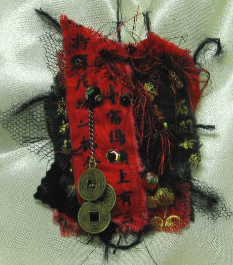
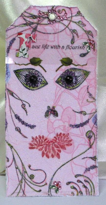
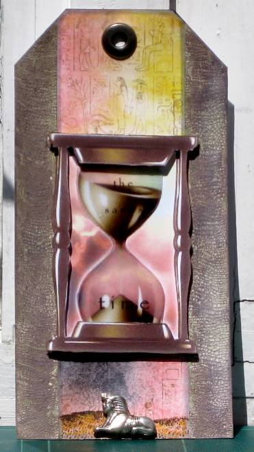
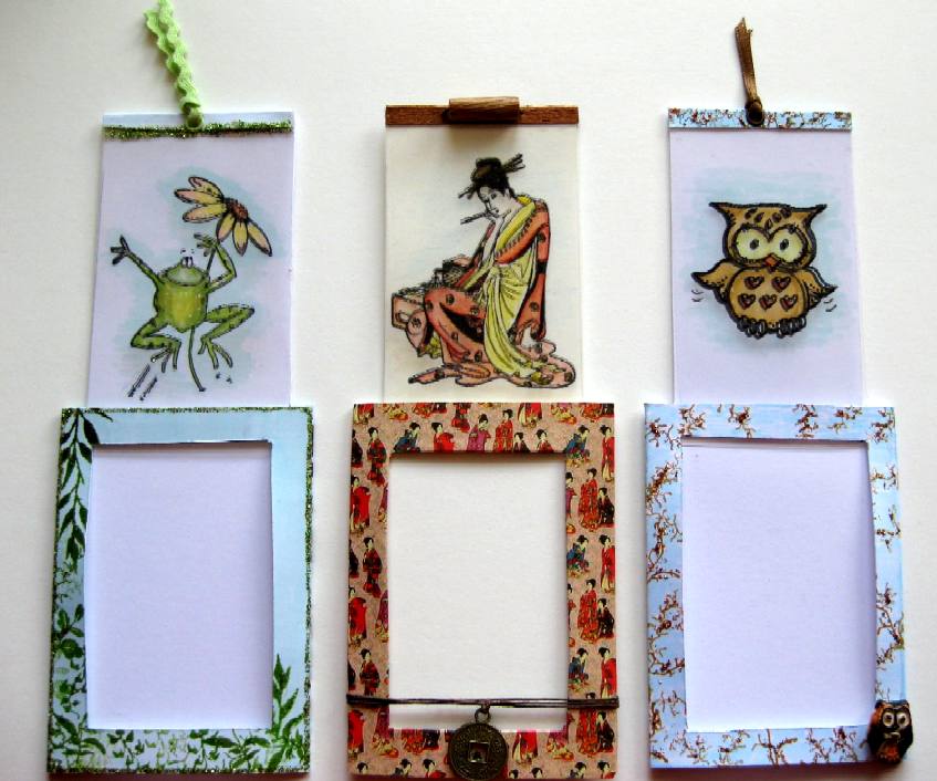
Inks: Black Stazon for the acetate, black document ink on the card, various colours
Card: white card, ivory card, acetate, decorative paper
Stamps: Penny Black toadily, Lavinia Stamps foliage, Rubber Stamp Tapestry (various), Sugar Nellie owl, Non Sequitur oriental love letters
Other: watercolour pencils, copic pens, ric-rac, ribbon, twine, coin, button, bead, stickles, eyelets

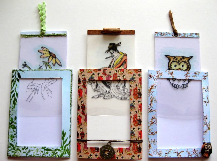
I found this link for a Magic pull up card years ago but I thought about altering it to make ATC sized versions for this months ukstampers swap theme ‘acetate’. I was using my ruler with inches on it so all the measurements are in inches.

Here is a tutorial to show how I made my ATC versions:

ATCs are 3 1/2 inches x 2 1/2 inches.
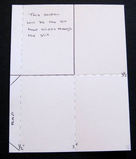
1
Measure some card stock 5 1/2″ x 7″ see Fig1
Score the 7″ side at 3″ (Fold 1)
Score the 5 1/2″ side (from the left hand side) at 1/2″ then 3″ (Fold 2 and Fold 3)

Fig 1

Fig1
2
Cut away the top left hand rectangle and save it for later – this will be the sliding piece.
Cut the corners off the flap at the left side
Cut a slot measuring 2″ x 1/4″ over Fold 1 as shown in Fig 2, leaving 1/4″ at both sides of the slot.

Fig 2

Fig2
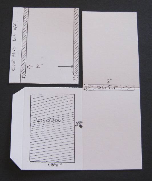
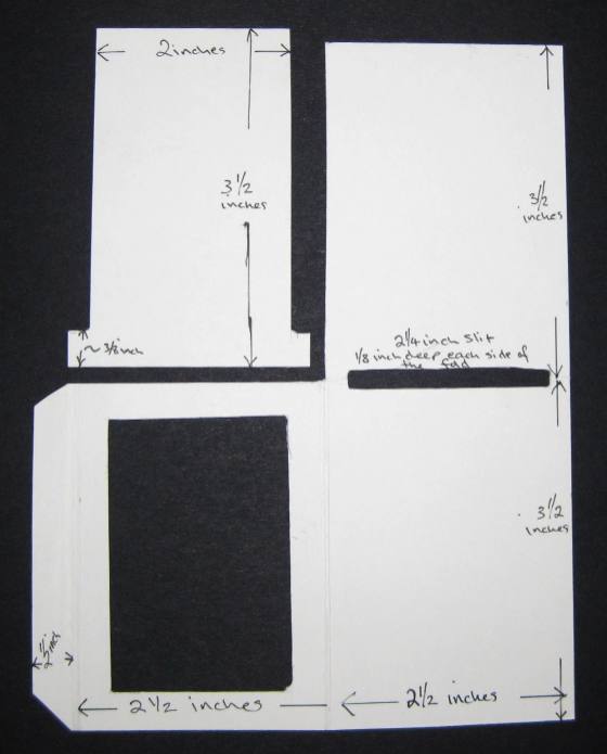
Mark and cut out a window from the left hand rectangle measuring 1 7/8″ x 2 3/4″.
Now get the rectangle that you saved earlier and cut the flap off first. Now mark and cut away a strip down both sides down to about 3/8″ from the bottom.
You should now have pieces that look like Fig3.
Make sure that the T shaped piece can slide easily through the slot and if not just take slivers off until it does.

Fig 3

Fig3
3
Fold the top rectangle down over the bottom one.
Fold the left hand window side over the to the right and tuck the flap in at the right hand side.
Try to make the folds ‘generous’ because the inside will contain 3 layers, this will help stop the sliding part becoming stuck.
Now that you know which side will be the front and back unfold it all again. You can now colour and decorate the outside. Take care to leave the inside panel plain as this is the side you will see through the window and acetate.

4
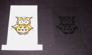
Stamp an image on the T shaped sliding piece (you can use the window to guide you so you stamp within that area). This image will be the coloured one so if you are using water colours choose a waterproof ink to stamp with.
Take a piece of acetate larger than the T shaped piece, place it over your T shaped piece and using Stazon ink or Brilliance ink stamp the same image onto the acetate directly over the previous image. Make sure your ink dries before the next stage. Holding the card and acetate move them around so the images are EXACTLY over each other and cut the acetate to the same size as the T piece using a craft knife or scissors. If you have a stamp positioner you could cut the acetate out first and use the positioner to get accurate results. This image will remain uncoloured.
Colour in the CARD image. see Fig 4

Fig 4

Fig4
5
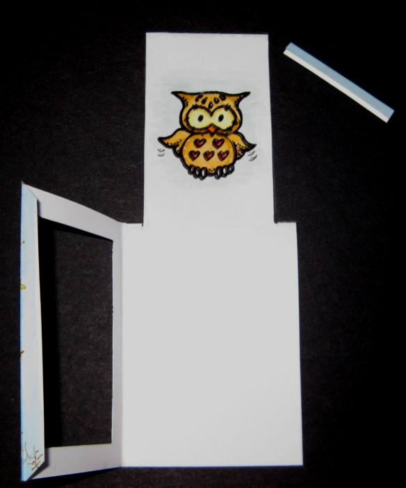
Fold the top right hand rectangle down over the bottom one. Slide your coloured card T piece all the way up through the slot until it stops.
Draw a very thin line of glue along the top edge only and place the acetate piece EXACTLY over it and stick it down. To disguise the glue you can add a small piece of card or ribbon over the top.

Fig 5

Fig5
Now push the slider all the way down and fold the front over. Put glue on the flap so that when you tuck it in at the back it will stick to the back and not to the slider. (you can just fold it over and stick it down without tucking it in if you prefer).
You can add eyelets and ribbon and decorate as you wish.

Tips:
When you fold it all over the first time it may not fold well so just take a sliver from the left hand side of the top rectangle and make the folds a little more generous.
The window can be any shape or size.
Try colouring your acetate image one colour and the card image another colour for a different. look.
If you stamp on the inside panel by mistake (as I have done before) you can still use it by folding to the left instead of to the right.
If you make a cardboard template then just use this to make others by drawing around it (saves having to measure things out) but remember to cut inside the pencil line when cutting it out but cut outside the pencil line when cutting out the window and the slit.
When adding embellishments to the front, remember not to stick them to the acetate.