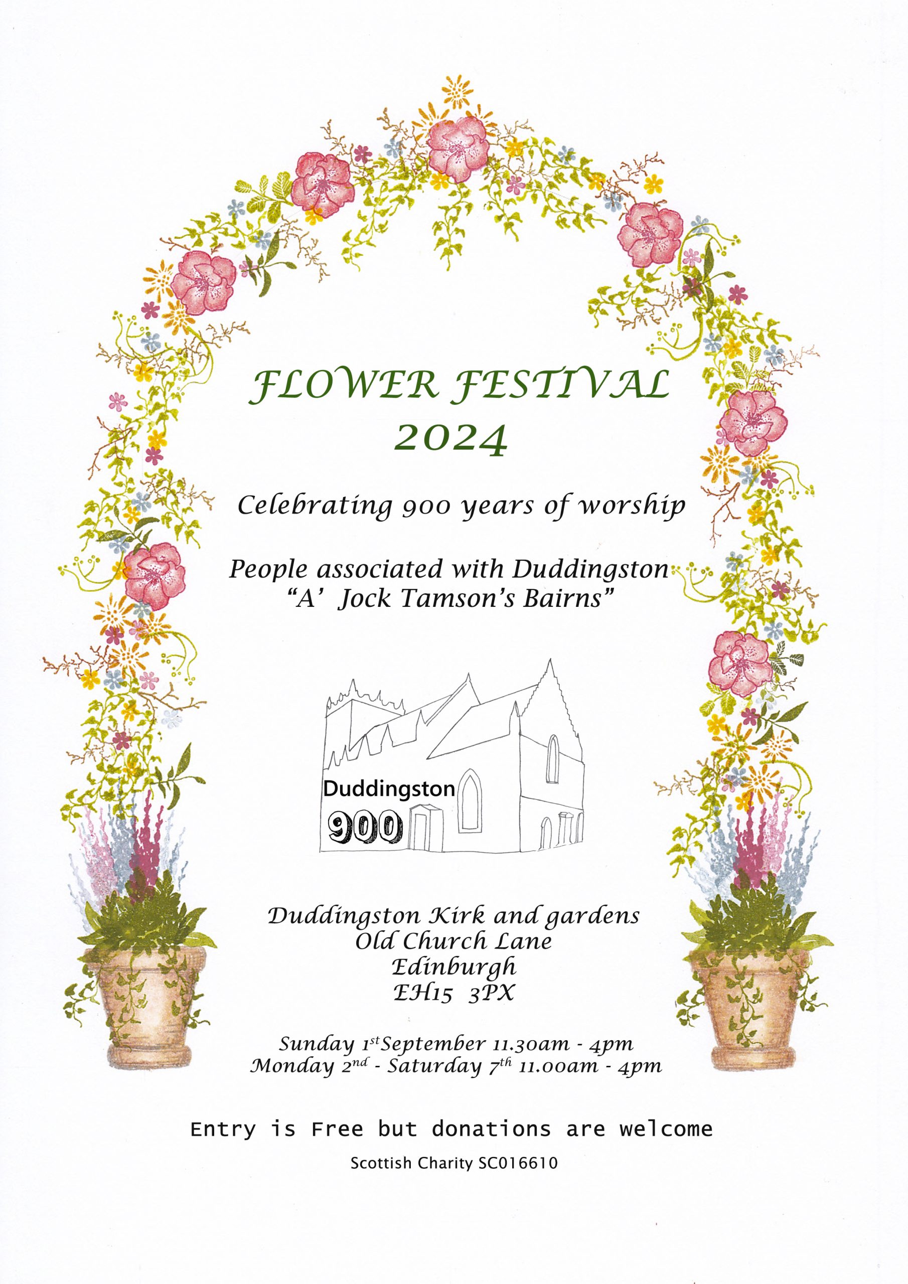
The Duddingston Kirk Flower Festival kicks off today and runs until next Saturday. There are floral installations representation some famous folk associated with Duddingston. It is part of a year long celebration of worship at Duddingston Kirk. I designed the cover and used tiny rubber stamps to create the floral arch and pots. Mostly peg stamps from Rubber Stamp Tapestry. I have seen the floral installations and they are stunning so it is definitely worth a visit.
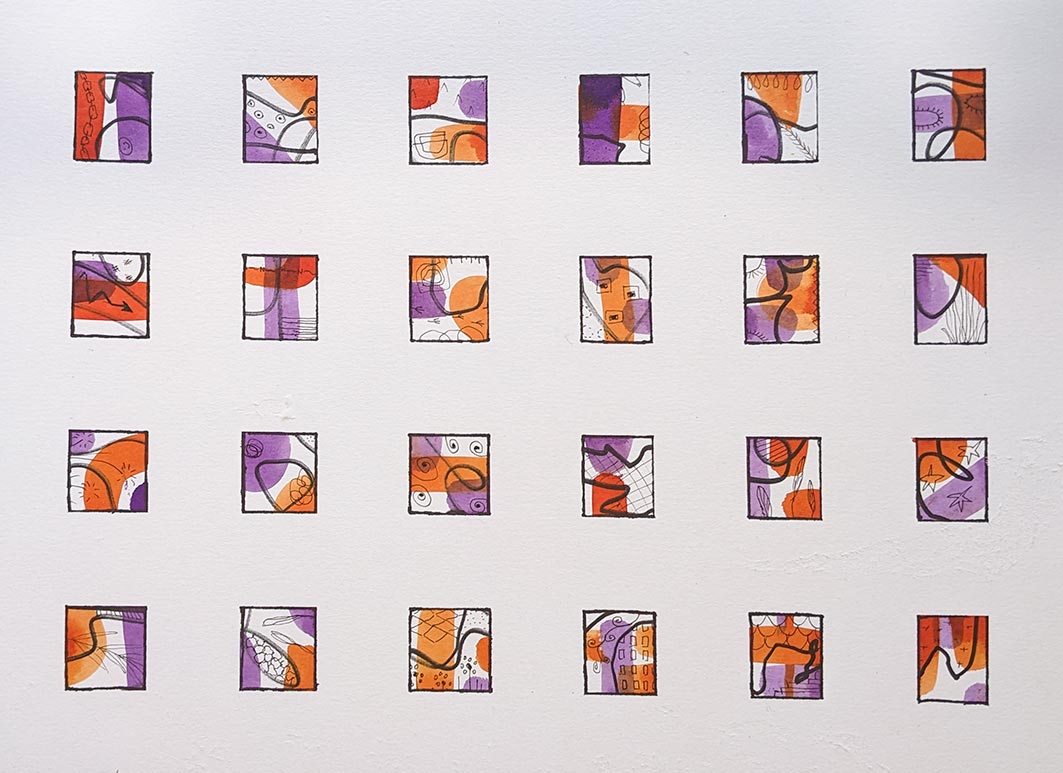
I am finding it difficult to get motivated to anything right now. The weather is just cold, wet and miserable and the craft room is too cold to work in. I am in a bit of a rut so I went through some old art journals and sketchbooks that I have for inspiration. The next few pics are from an old small 9cm x 14cm hard cover sketchbook (maybe a Talens Art Creation book). They are quite good little books but as I open them out to do double pages the spine takes a bit of a bashing. I used quotes that I liked and tried out multi media and methods. So I am feeling inspired to do more of the same.
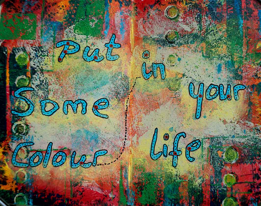
There is a youtube channel called ‘Put some colour in your life’ so using mainly acrylics and pastels and some posca pens I made this colourful double page spread.
Colour in your life.
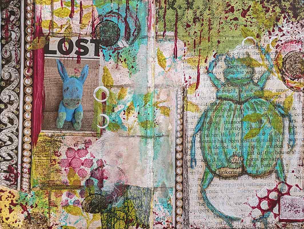
For this one I collaged some clips from magazines and an old page from a book. I highlighted the words ‘craft’ and ‘tinkering’ in the book page as when I am feeling a bit lost I like to just tinker and play in the craft room rather than go full steam into a project.
Lost.
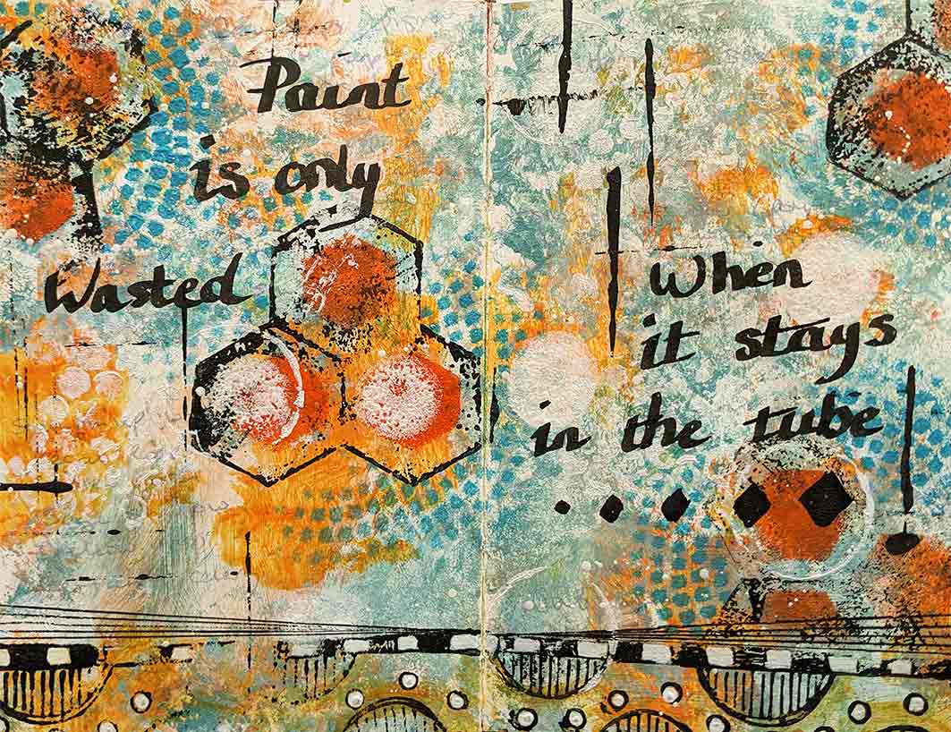
One of my bug-bears of painting is that it uses up a lot of paint and supplies which is expensive and I used to worry that I was wasting not only time but all of my art media if things didn’t turn out well. This quote helped me change my attitude to that way of thinking. Paint is only wasted when it stays in the tube – so true.
Wasted paint.
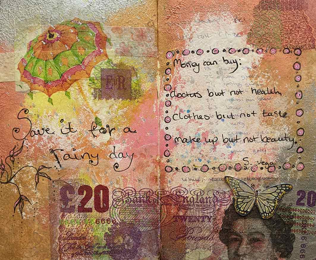
I think the next quote was by Suzanne Vega. ‘Money can buy: doctors but not health, clothes but not taste, make-up but not beauty. ‘ More collage work using collage papers and a napkin £20 note.
Money can’t buy:
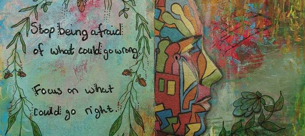
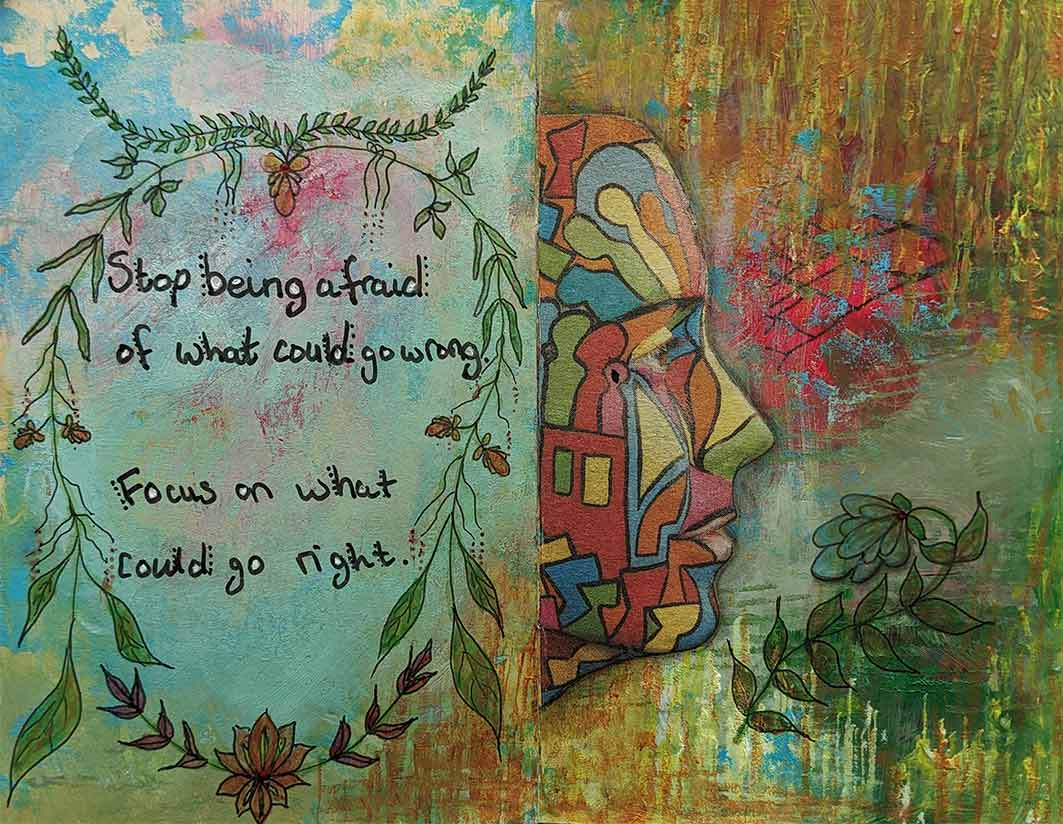
Always worrying about things not turning out right will stop you doing anything, so you have to focus on what can go right and not what could go wrong.
Focus on right.
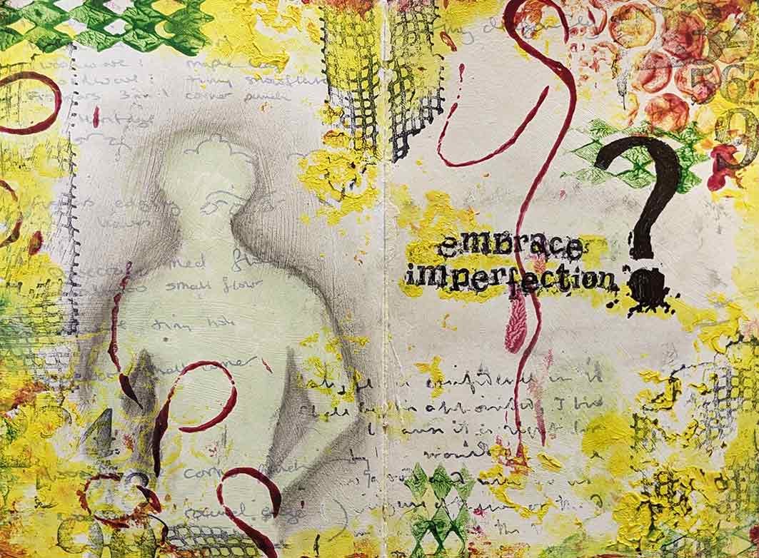
Don’t strive to be perfect but just making progress is good enough. Embrace imperfection uses acylics and stamps. I used to use this little book to list all the media (stuff) that I had so that I wouldn’t buy doubles but that never worked so I painted over the pages to use it as an art journal instead. Here I have left some of the writing showing through the paint. It is a nice wee reminder that it isn’t about what you have, but how you use it that counts. Wabi sabi comes to mind as the Japanese find beauty in imperfections.
Embrace imperfection.
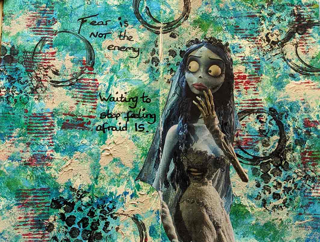
Fear of the blank page (or anything else in life). this quote sums it up nicely. ‘Fear is not the enemy. Waiting to stop felling afraid is’. I don’t know where some of these quote come from, maybe a pod-cast I was listening to or a TED talk? Mainly acrylics in this one and a bit of collage and stamping using found objects.
Fear.
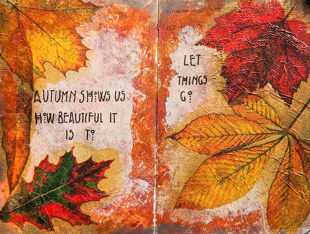
Using napkins with bright autumn leaves on and gel medium, I added this quote; ‘Autumn shows us how beautiful it is to let things go.’ Oh if only we could just let things go.
Let things go.
So I still have plenty pages to fill up yet just need some more quotes.
That is another year gone. Where did all that time go? I am so good at procrastination and wasting time that I have become quite an expert. This isn’t what I wanted become an expert in so I will have to change that and utilize my time more efficiently in future. I am not going to answer my phone (text/emails etc) while I am doing craft-work, and I am going to set boundaries to make sure I am not interrupted. I often feel that the universe is out to thwart my attempts at getting some craft time: the numerous bleep alarms for taking meds/eye drops, tea times and pee times. As soon as my hands get hold of a pen or paintbrush somebody comes to the door. I just set up my craft table to do some macro photography only to find my husband has put his washing on. Great you might think – he has put his own washing on, however, the washing machine is just in the other room and the vibrations mean that, despite using a tripod, I can’t get my subject in focus. Ok enough with the excuses!! Here is a wee doodle I did to make a greetings card.
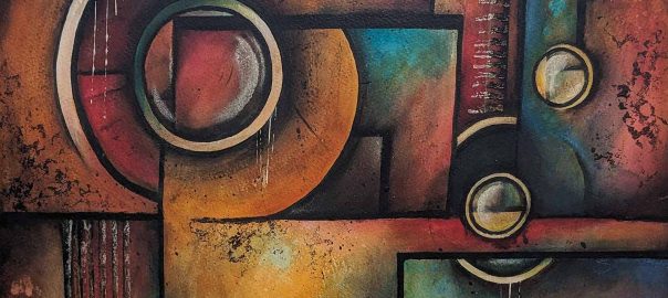
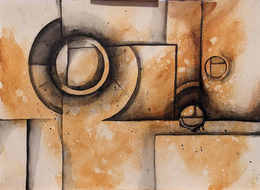
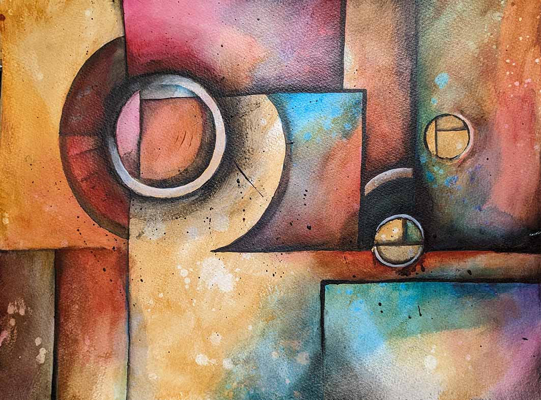
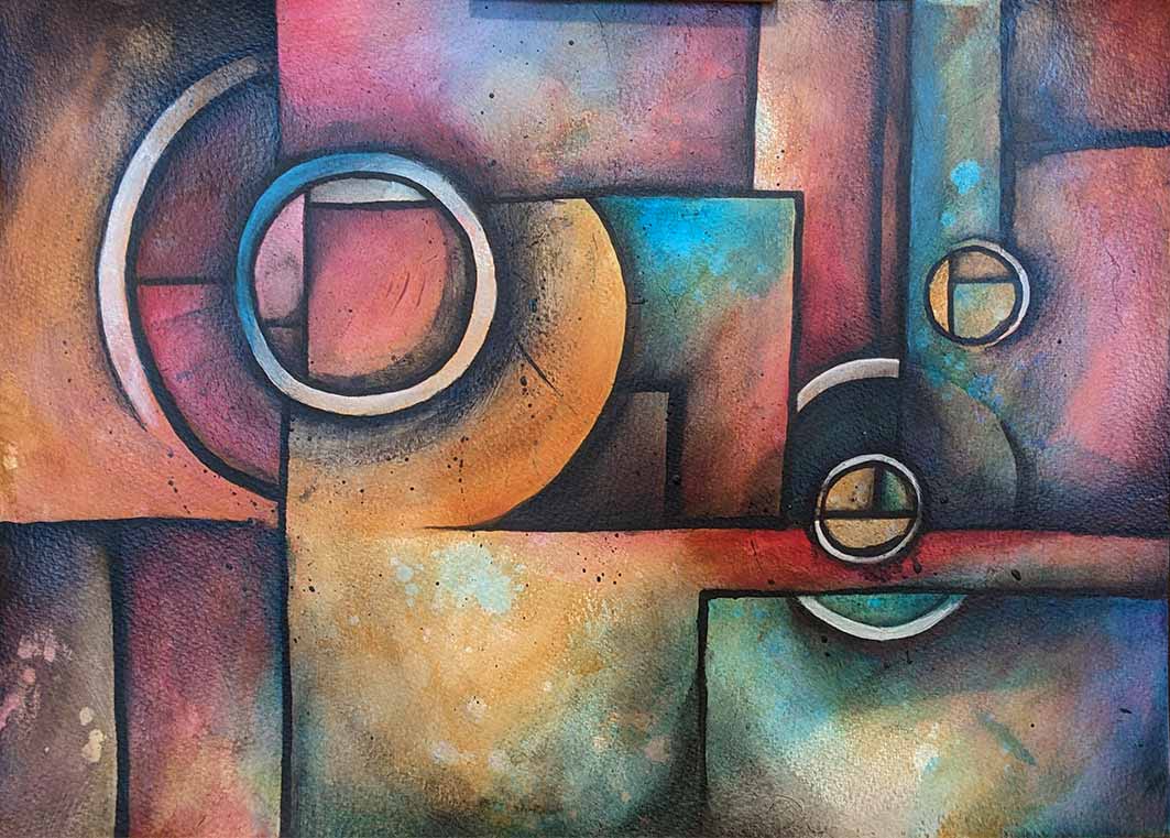
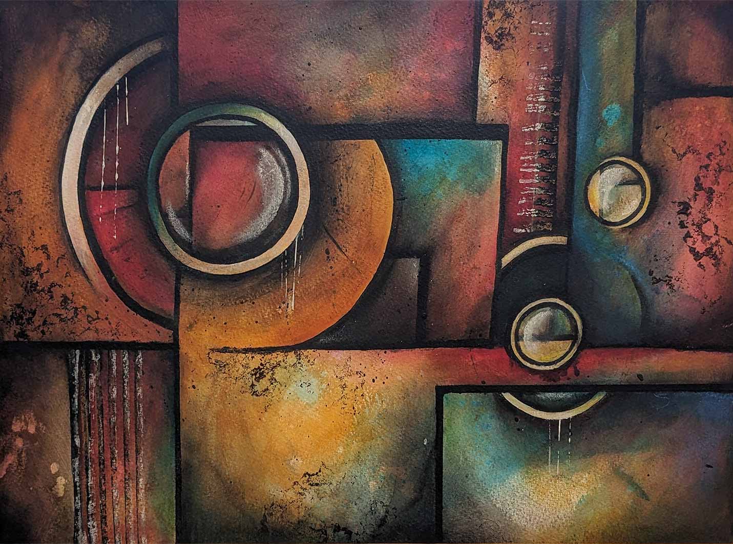
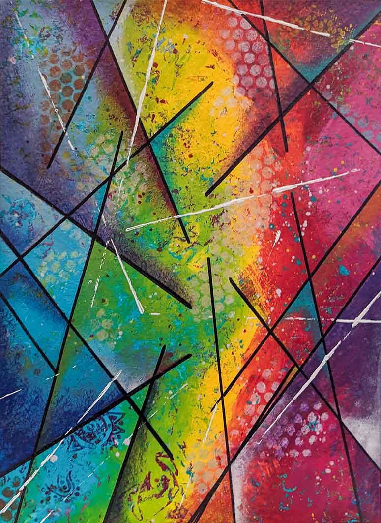
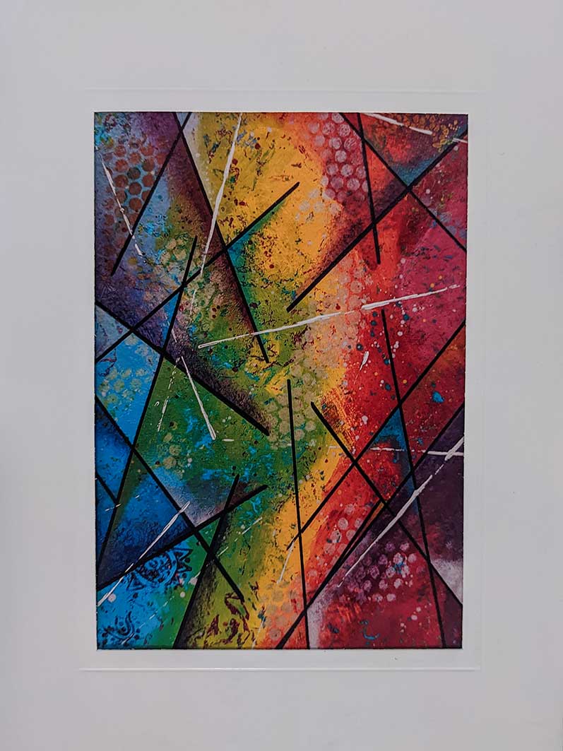
I love Michael Lang’s large abstract paintings and decided to have a go following one of his you tube videos and I enjoyed learning his blending techniques although I didn’t exactly master it. I found it difficult to keep my circles round and my straight lines straight but it looks ok from a distance. I also couldn’t get the drippy technique – partly due to the buckle of the paper (he used a flat board) and I just couldn’t quite get the right consistency. I used mainly acryics and acrylic medium, but also pens and finished with gel pastels to brighten a few areas. The camera didn’t pick up the aqua colours and made them look a bit blue.
Well I think I am finished the painting. It will probably sit in my folder and I will pull it out every now and then to see if I want to add anything else to it.
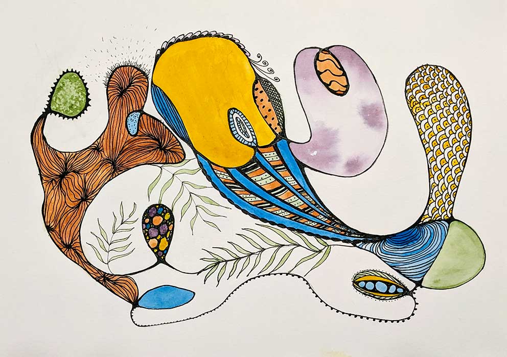
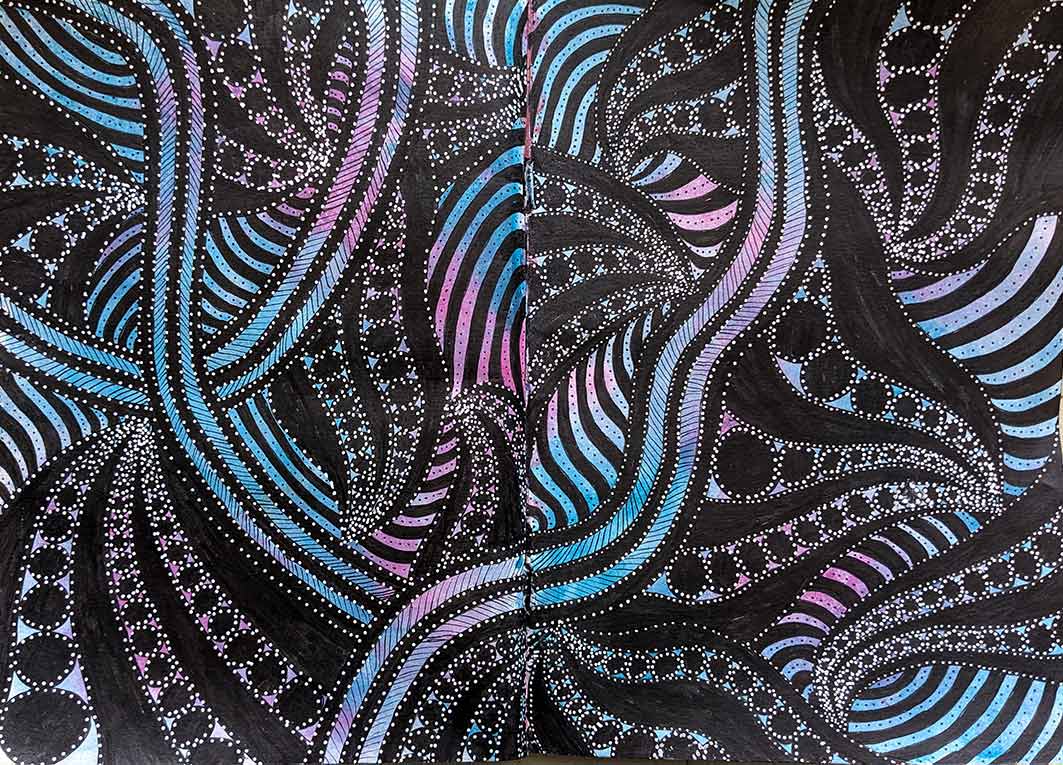
You know that feeling when you are anxious and overthinking and you just want your brain to stop. Mindfulness and breathing are useful tools, but then doodling can be pretty good too, at allowing yourself to be in the present moment. This is what I was doing yesterday after watching linaforrester on instagram. I loved the colours she used (bright green and yellow) but I wanted to try my own colour combo. I have a few Ecoline liquid watercolours that I haven’t touched in years so I made up an orange and a purple and gave it a go. Sadly my ‘Delicate surface Frogtape – low tack painter’s masking tape’ ripped my paper in a couple of areas when I was very carefully peeling it back. It may be that the paper pad I was using was too old (the cover had come off so don’t know what it was) or that I was leaning on it too hard while doodling. Hey – ho these things happen. It was fun to do.
It has been a while since I last did anything in the way of art so just to get my little grey cells thinking creatively again I got out an old art journal, that I hadn’t filled, and randomly put down some colour for the background across 2 pages. Next, I doodled about with some black lines and filled some areas in. It was way too black so I brightened it up with white dots and just had a play. It isn’t quite zentangle but it was fun to do and a good way to get me back into doing some art.
More playing with my acrylic paints and watching you tube videos. It was good fun and getting me back into painting again. I painted it in my large art journal, then took a photo, shrunk it and printed onto photo card, and this time to make a card I put it inside a white aperture card.
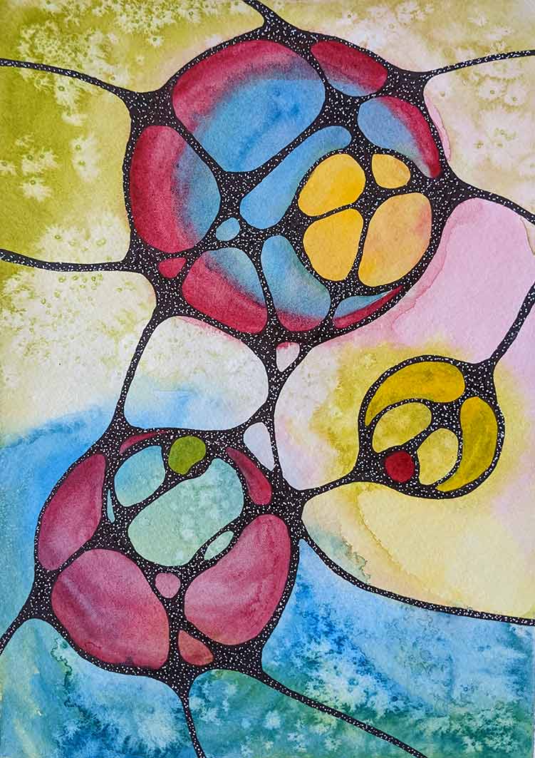
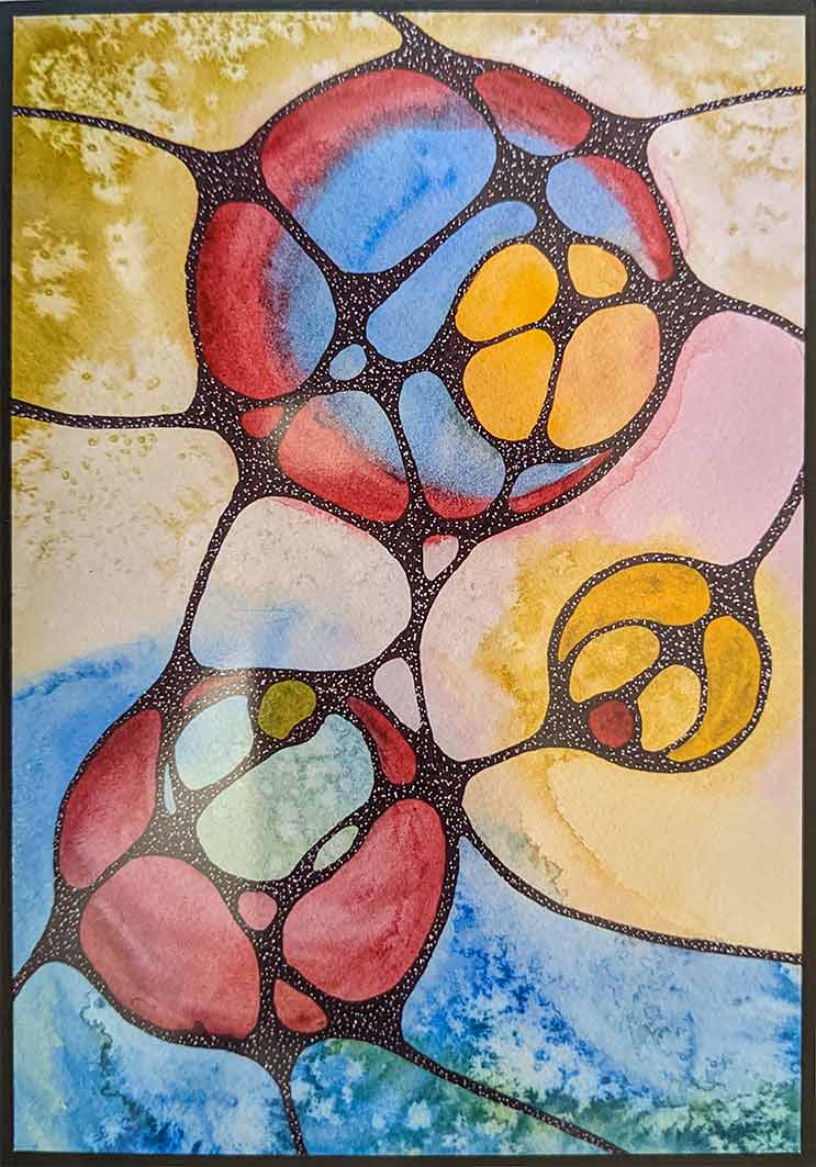
The last few months I have been concentrating on the garden and keeping it alive during the hot weather. Lately we have been having the conservatory fixed so all the plants that lived there had to be kept on every available table in the house so I didn’t have access to any table. I finally got my table back and had a go at some neurographic art. There are quite a few you tube videos https://www.youtube.com/watch?v=NtKSOUV7U8U that show you how to do it and although there is an actual therapeutic method, I just did it for fun.
This is the painting, and I took a photo of it and shrunk it to make a greetings card with a black border. The card is white but as my scanner wasn’t working I had to use my phone camera to photograph it and the card wouldn’t sit flat so I just cropped the white of the card out.
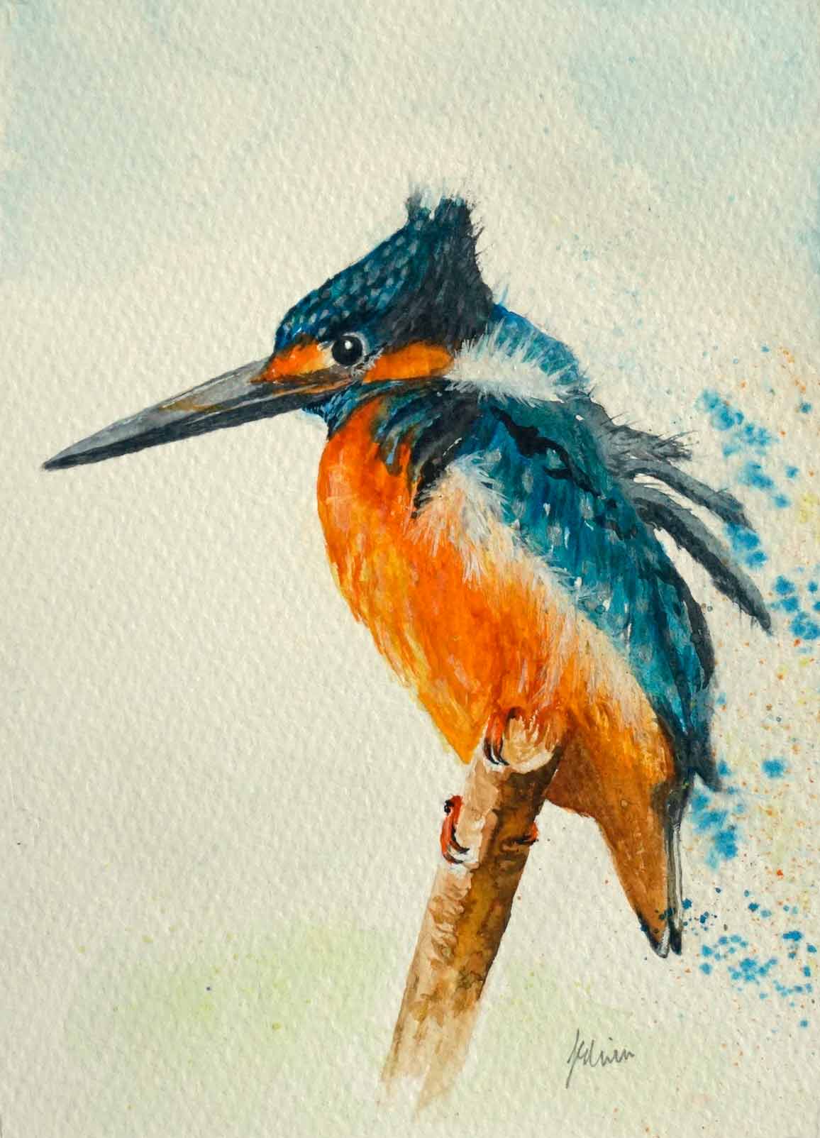
Ali Hargreaves gave another fab demo on Artist Demo Days on facebook, this time a watercolour (or mixed media) of a rather bedraggled kingfisher. I had a go and made a small painting and it was fun to do. I still haven’t found a way of getting the turquoise colour to be true on the photo. I used some shimmering blue acrylic ink and some pearl Pearlex for some of the white flashes on a few feathers. In other places I have used white acrylic ink and pulled the ink out to makes the ruffled feathers. You can also find her demo here.
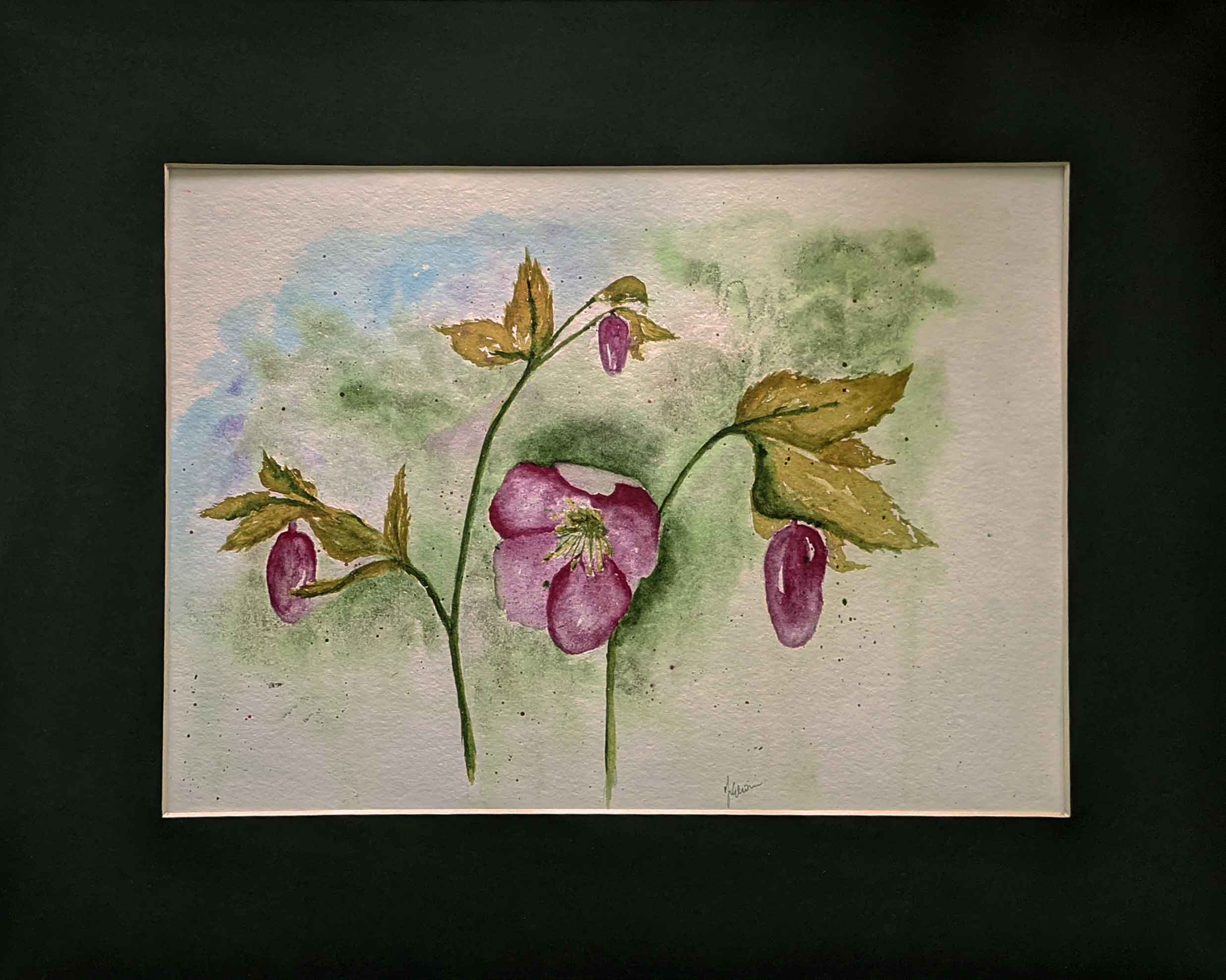
I had a go at Ali Board’s watercolour of some lovely hellebores from her book (A beginner’s guide to Watercolour with Mixed media) . I have many of these in my garden but they aren’t looking there best right now and, although I do have a few of my own photographs of my hellebores, they don’t look as nice as the ones in her book.
I quite like how it turned out but I still need to get looser with the paint. And the phone camera never picks up the subtle shading so it looks a bit bloby and patchy.