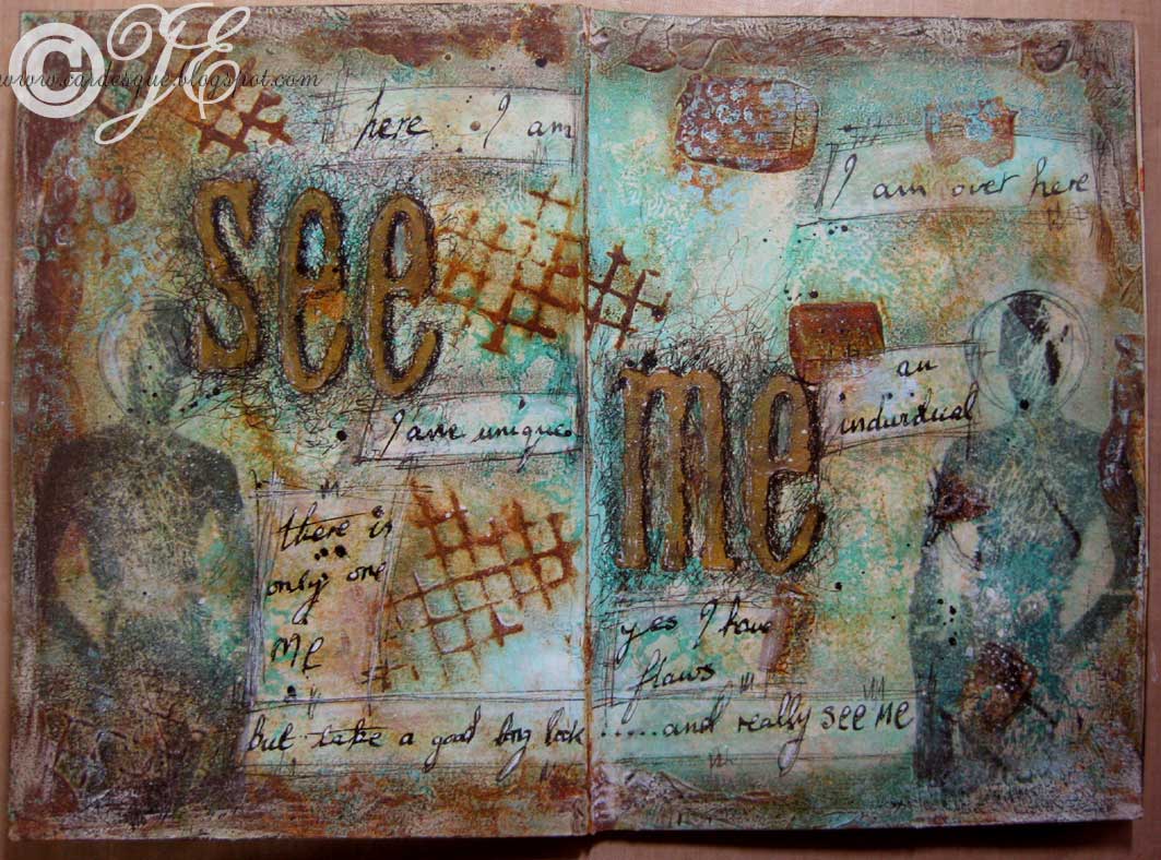
At first I was not at all pleased with these pages as they were just a bit too messy (more mess than grunge) but they are growing on me. They reflect how I was feeling at the time: invisible, ignored, angry, frustrated, people looking through or past me, not being heard, being dismissed…….and so on. I find the scribbles and scratches get over the angry frustrating feelings while the images of the grungy silhouettes signify me just blending into the background.
I feel like this a LOT!!
Inks/paint: various acrylic paints, Memento Tuxedo black, Stampin up Taken with teal, Speedball India ink
Card: plain journal, tissue paper (stamped with the grungy silhouettes)
Stamps: Dina Waklay Grungy silhouette D1007, Tim Holtz alphabet, Scrolls Work Stamps Netting, Paperbag studios Scrap journal (bubble wrap stamp)
Other: Crafty notions Rusting powder and vinegar, Oil pastels, white pen, Black Pitt pens, Glue n seal
I think the limited colour palette stops it being messy – looks very cohesive to me. And wonderful art too.
I agree with Deb, the colour palette makes it cohesive even though there’s a lot going on here and it’s a perfect example of what’s good about art journaling – it gives you an avenue to express frustrations as well as happier things.
I think the colours and texture work well too. Venting is really what it is about, although sometimes I vent so much they are not for public consumption. Love the pale blue contrast with rusty colours.
What a fab rusty effect…..I think they’re great pages, lovely misty colours that contrast with the rust.
sorry you’ve been feeling so crappy, hope things are on the up now! and your pages look great 🙂