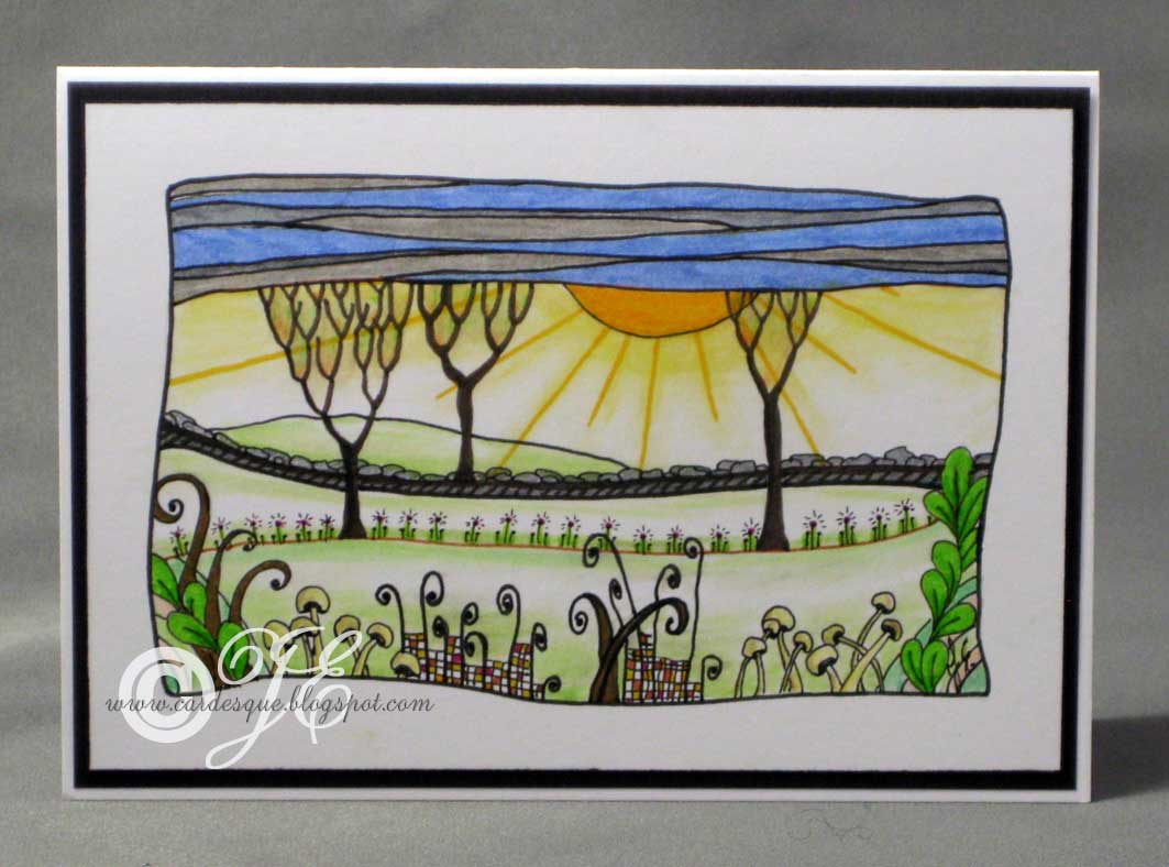
A little zentangle birthday card from me today. Although it is actually quite a simple card it took ages to do. It is coloured with a mixture of watercolour pencils and copic pens.
A little zentangle birthday card from me today. Although it is actually quite a simple card it took ages to do. It is coloured with a mixture of watercolour pencils and copic pens.
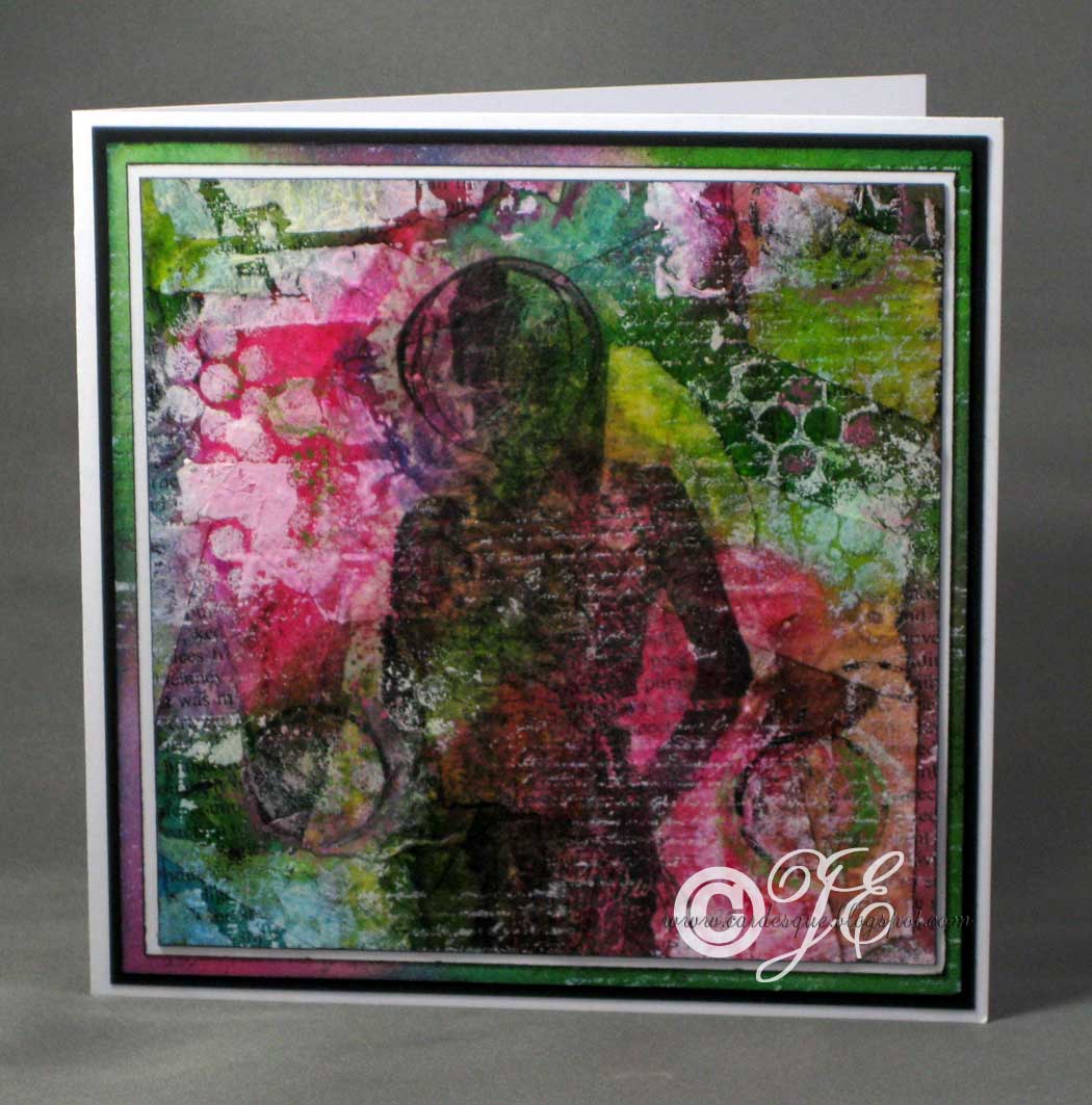
Inspired by Craft stamper again but can’t remember the issues, I used a mixture of techniques. Using an A5 piece of old card I started making the background using torn masking tape along with some ripped pieces of text from an old book sticking them haphazardly over the whole piece of card.Then I applied some Distress inks to the page (tiny drops from re-inkers) and smooshed it around with a baby wipe so that some of the ink highlighted the edges of the tears. I gave it a light spray with water and while it was still wet I sprinkled on some salt in some areas. Once dry the salt was then wiped off. Using various found items I made some marks with black and white acrylic paint and stamped some text using white acrylic paint (I tried various white inks but none of them came out well).
Next I stamped the silhouette onto tissue paper and stuck that onto my card. Stamped more white text over the image and highlighted areas with oil pastels. Cut the size you need then mat and layer it all on the card. Similar background card was created with ordinary white card as one of the layers.
Inks: Memento Tuxedo black, Distress re-inkers Picked raspberry, Moved lawn and Salty ocean
Card: white and black
Stamps: Dina Wakely grungy silhouette D1007
Other: black and white acrylic paint, oil pastels, torn book pages, masking tape
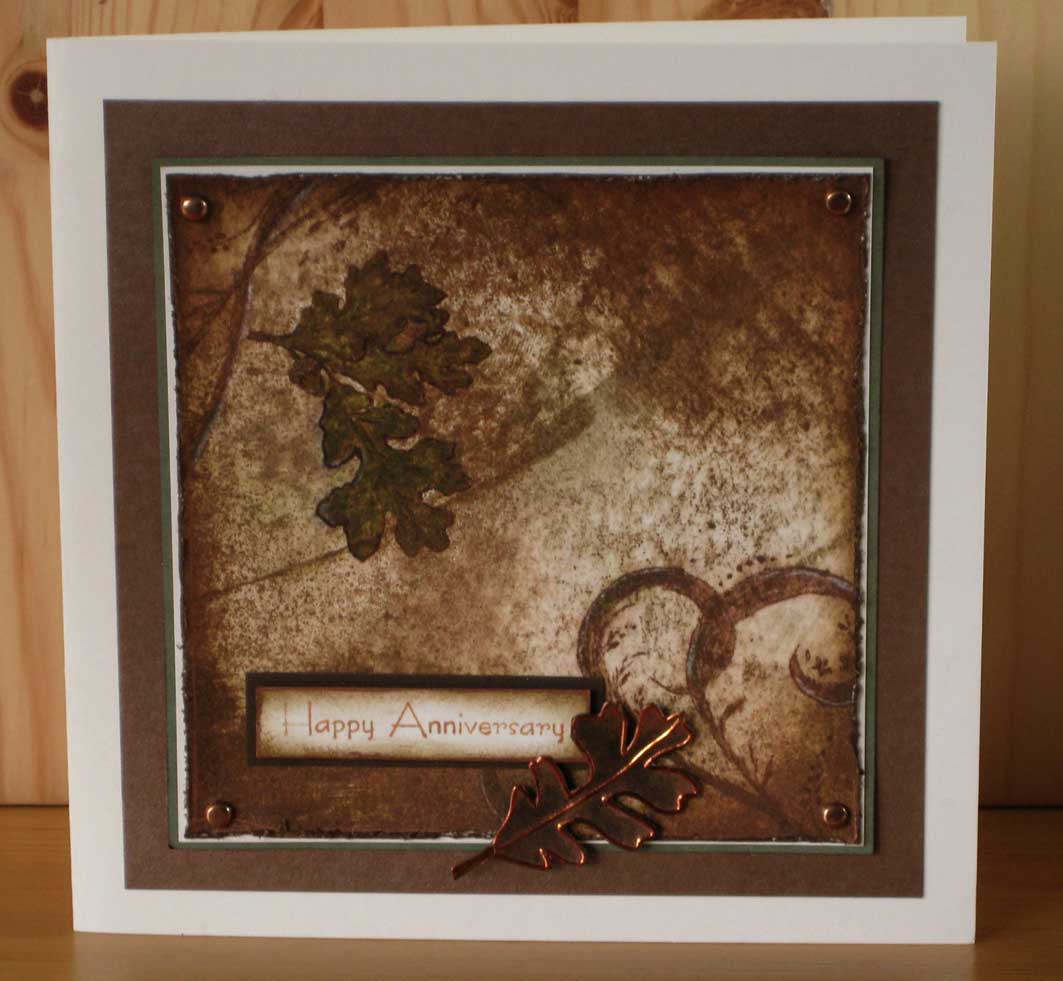
I really liked the look of Michelle Zindorf’s card she made in one of her tutorials #543 so I wanted to make my version for my mum and dad’s anniversary. As usual I have tweaked a few bits to make it a little different but keeping to her overall design. The grungier type of swirls go better with this very rustic grungy type of image. The direct to paper technique makes every card look different as you can never swipe the inks pads identically.
Inks: Stampin up Soft suede and Crumb cake, Adirondack Espresso
Card: ivory, dark green, pearlised brown and dark brown card
Stamps: Stampin up Lovely as a tree and Cheer and wishes, Creative expressions Swirl elements, Tim Holtz Urban tapestry (texture stamp)
Other: copper peel-off leaf (darkened with brown Sharpie pen to dull the copper), Tombow green pen, Moonshadow ink Incandescent copper, copper brads
I did use a white pen to create highlights but I smudged them in a little as they were just too bright.
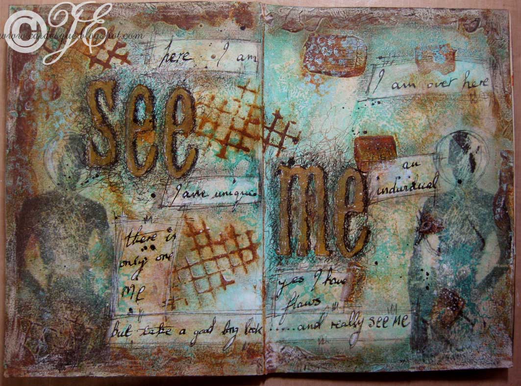
At first I was not at all pleased with these pages as they were just a bit too messy (more mess than grunge) but they are growing on me. They reflect how I was feeling at the time: invisible, ignored, angry, frustrated, people looking through or past me, not being heard, being dismissed…….and so on. I find the scribbles and scratches get over the angry frustrating feelings while the images of the grungy silhouettes signify me just blending into the background.
I feel like this a LOT!!
Inks/paint: various acrylic paints, Memento Tuxedo black, Stampin up Taken with teal, Speedball India ink
Card: plain journal, tissue paper (stamped with the grungy silhouettes)
Stamps: Dina Waklay Grungy silhouette D1007, Tim Holtz alphabet, Scrolls Work Stamps Netting, Paperbag studios Scrap journal (bubble wrap stamp)
Other: Crafty notions Rusting powder and vinegar, Oil pastels, white pen, Black Pitt pens, Glue n seal
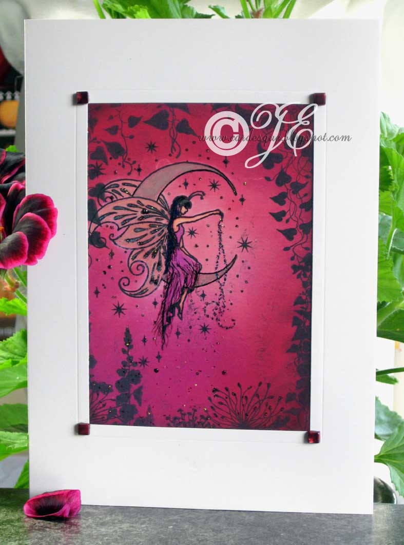
This card was inspired by the Craftstamper mag. but it is an amalgamation of a few ideas all of which I have used in various art journal pages but not usually in my cards. I used acrylic paper as I wanted it to look a bit like canvas but I had to be careful with swiping it with baby wipes as the surface disintegrates. I maybe should have given it a thin wash of gesso first.
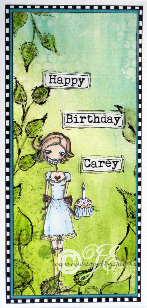
Only one Candle Carey 😉
Inks: Black India ink, inktense pencils to colour image, copic pen for skin (not good with the India ink though), Acrylic paints: Black, Lime, Moss, Turquoise and White
Card: acrylic card, white card, turquoise card
Stamps: Stampotique Karen, Cute companions Patchwork number set 2 (little cup cake), computer generated text
Other: black pen
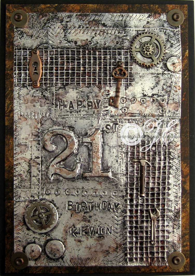
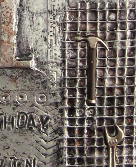
So I was blog hopping the other day and landed on Kaz’s blog where she did a metal foil covered tag inspired by Tim Holtz. I have used this technique a few times previously but had forgotten about it and it was just the reminder I needed for creating Kevin’s card. It more or less uses the same technique but I added some discs, numbers and magic mesh underneath the aluminium tape to give lots of texture and dimension. I used paper stumps and embossing tools to smooth the tape gently around these additions and going inside all the little squares made by the mesh. The text I made using metal stamps. I have used this kind of technique before but instead of using alcohol inks to colour the metal foil in the recesses of the texture I used black acrylic paint then swiped some areas away with a baby wipe before it had dried completely.
Inks: Alcohol inks Pitch black, Stonewashed and Rust
Card: white, black antiqued metal card
Stamps: metal alphabet stamps
Other: Aluminium foil tape, small discs, Ideology: fasteners, washers, and cogs. Hammer, wrench, and keyhole brads, small key charm
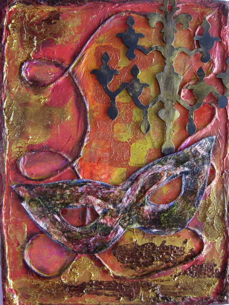
My original canvas has now had another 4 layers put on it.
Rosie added layer 2: string and tissue applied with Matte gel.
Pam layer 3 ?
Lou did layer 4: added the mask and chandelier.
Pauline did layer 5: changed the colour of the mask from bright blue using napkins, added distress inks, glitter glue and crackle paint.
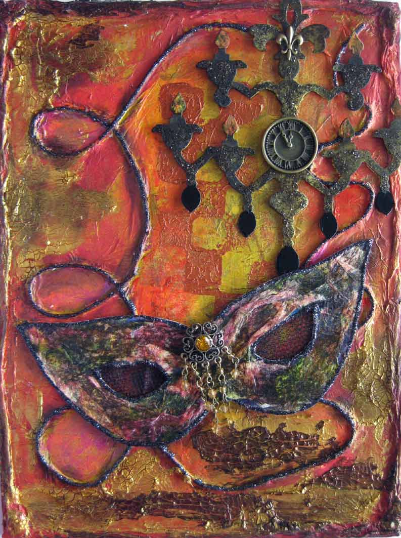
I added a final layer 6: black glitter on the mask edges and string, tucked black mesh behind the eye holes, black gel pen, distress stickles, bits from old jewellery, charms. I might add some words into the string loops when I think of something.
I love this Pass the Painting collaboration!
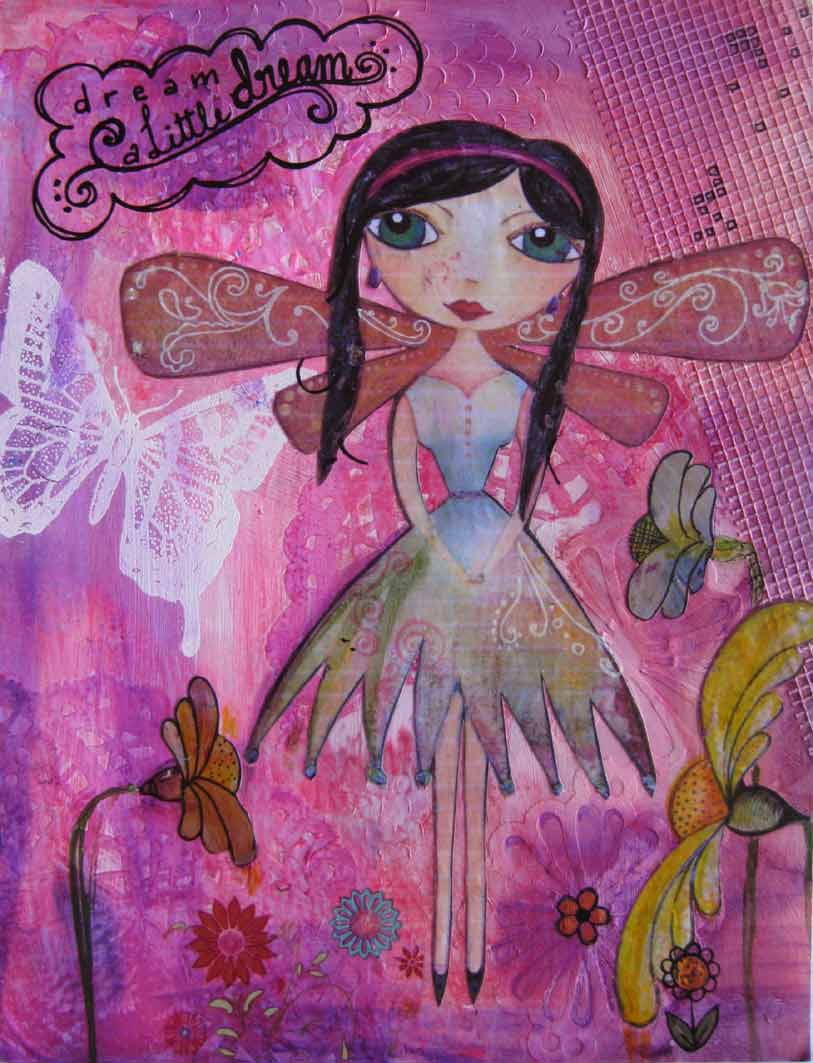
This canvas is Rosie’s Pass the Painting as she did layer 1: texture with reinforcement rings, Martha Stewart punch and adhesive webbing.
Pam did layer 2: more texture with smooth gesso and gesso through sequin waste.
Lou did layer 3: Doilies, watercolour paint (raspberry and brick red), embossed butterfly.
Pauline did layer 4: petite doll and flower images, writing Dream a little dream, ranger inks and Faber Castell pens.
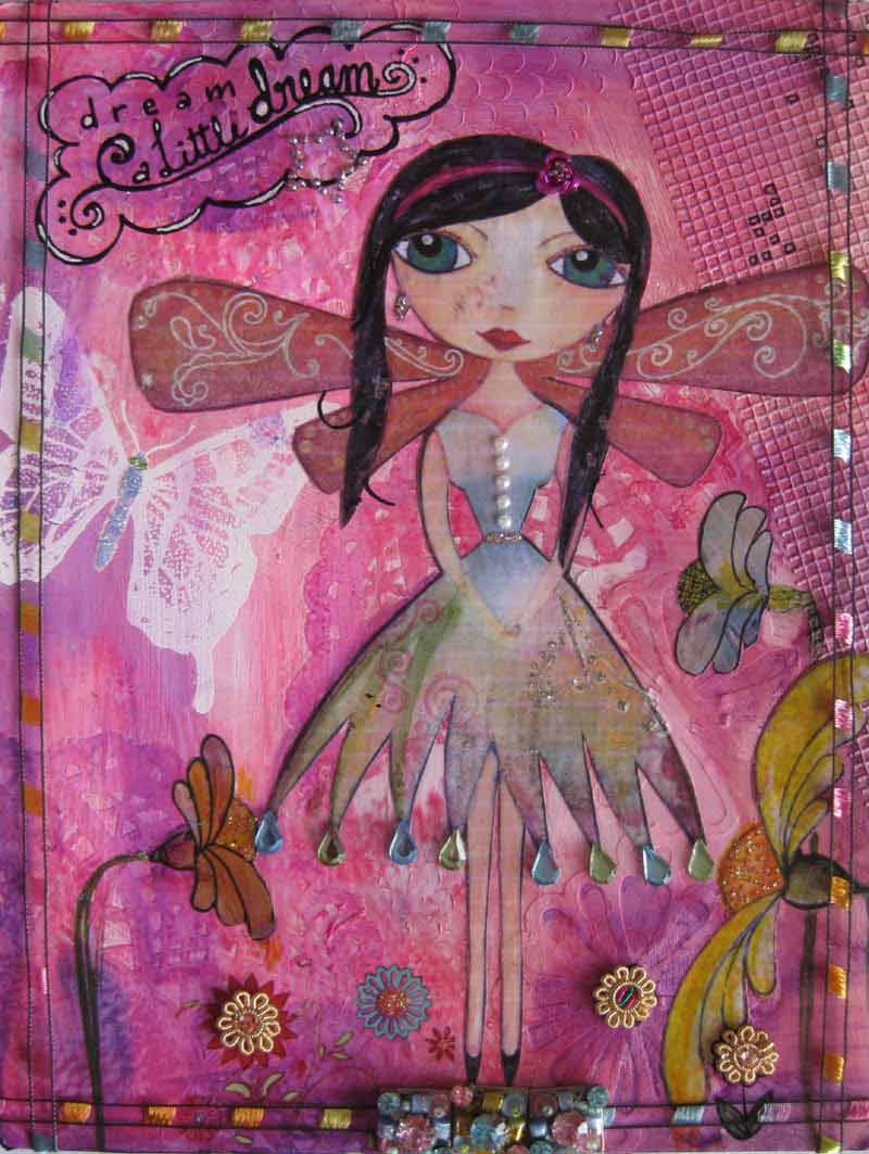
My addition layer 5: bling – gems, pearls, stickles, white pen to highlight, old jewellery bits, and ribbon.